The Brief
WarmRed aimed to revitalise the Shipowners’ Club brand. The goal was to keep it relevant and future-focused, while respecting its long history and expertise. We needed a new look that clearly conveyed professionalism, trustworthiness and comprehensive service. The brand had to appear dynamic and reliable. It also had to resonate with smaller and specialist vessel operators, the Club’s target audience.
The redesign had to express security and build on the Club’s 170 years of experience. At the same time, it needed to demonstrate forward-thinking innovation. This approach aligns the Club with the evolving maritime industry. The new identity sets the stage for continued growth and evolution in the global market.
Design Approach
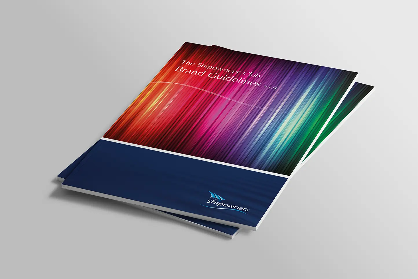
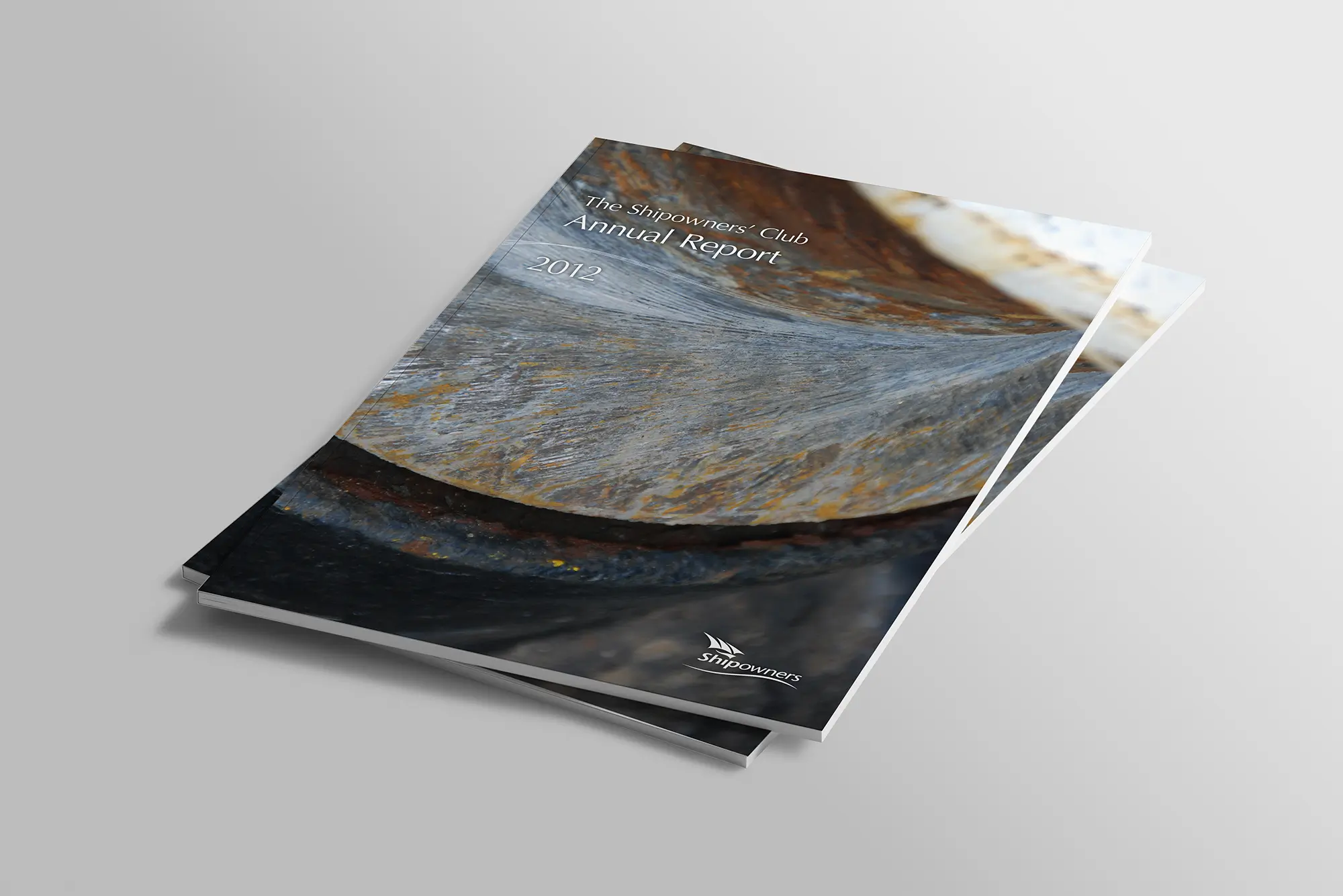
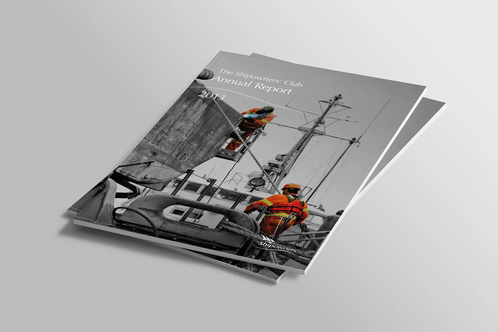
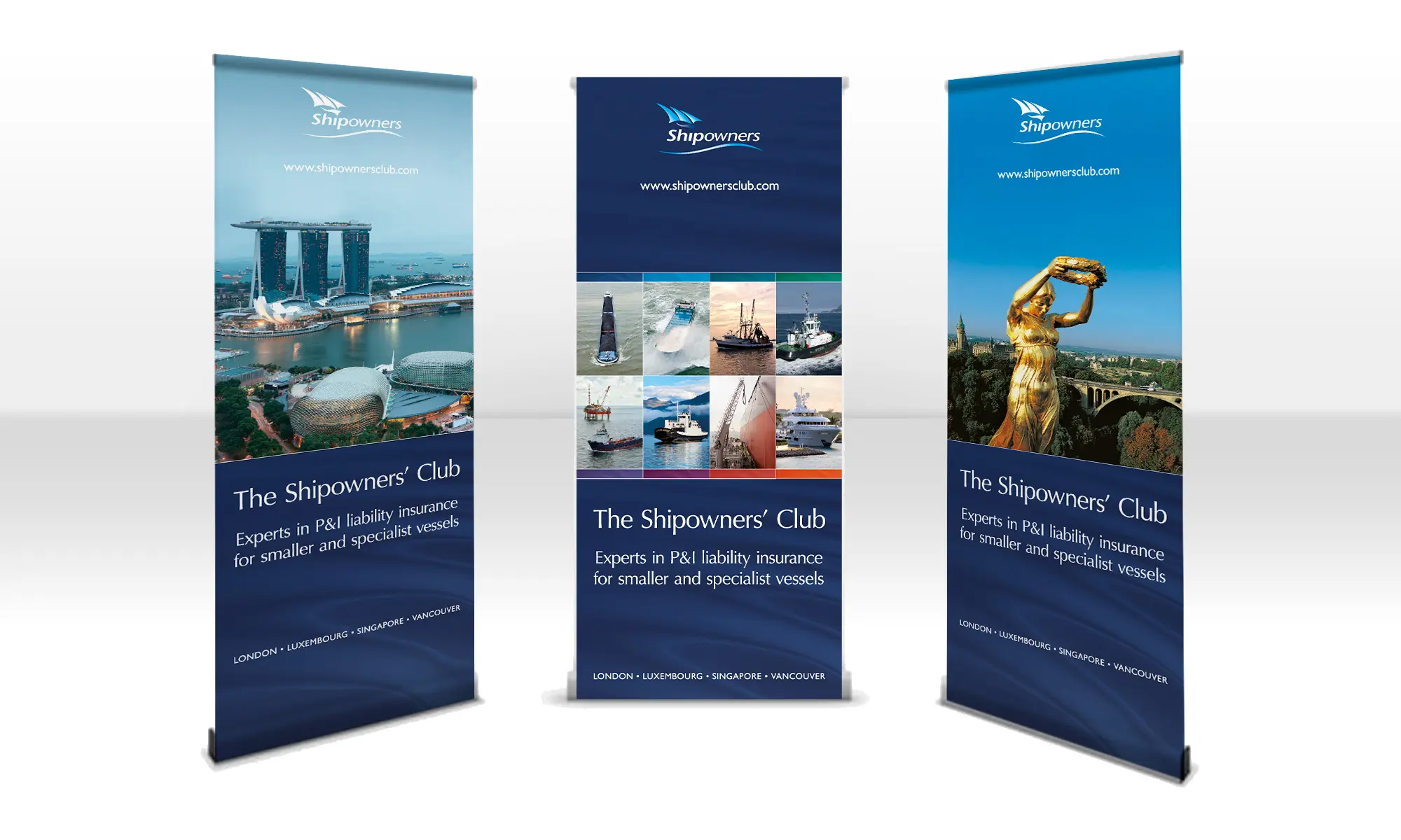
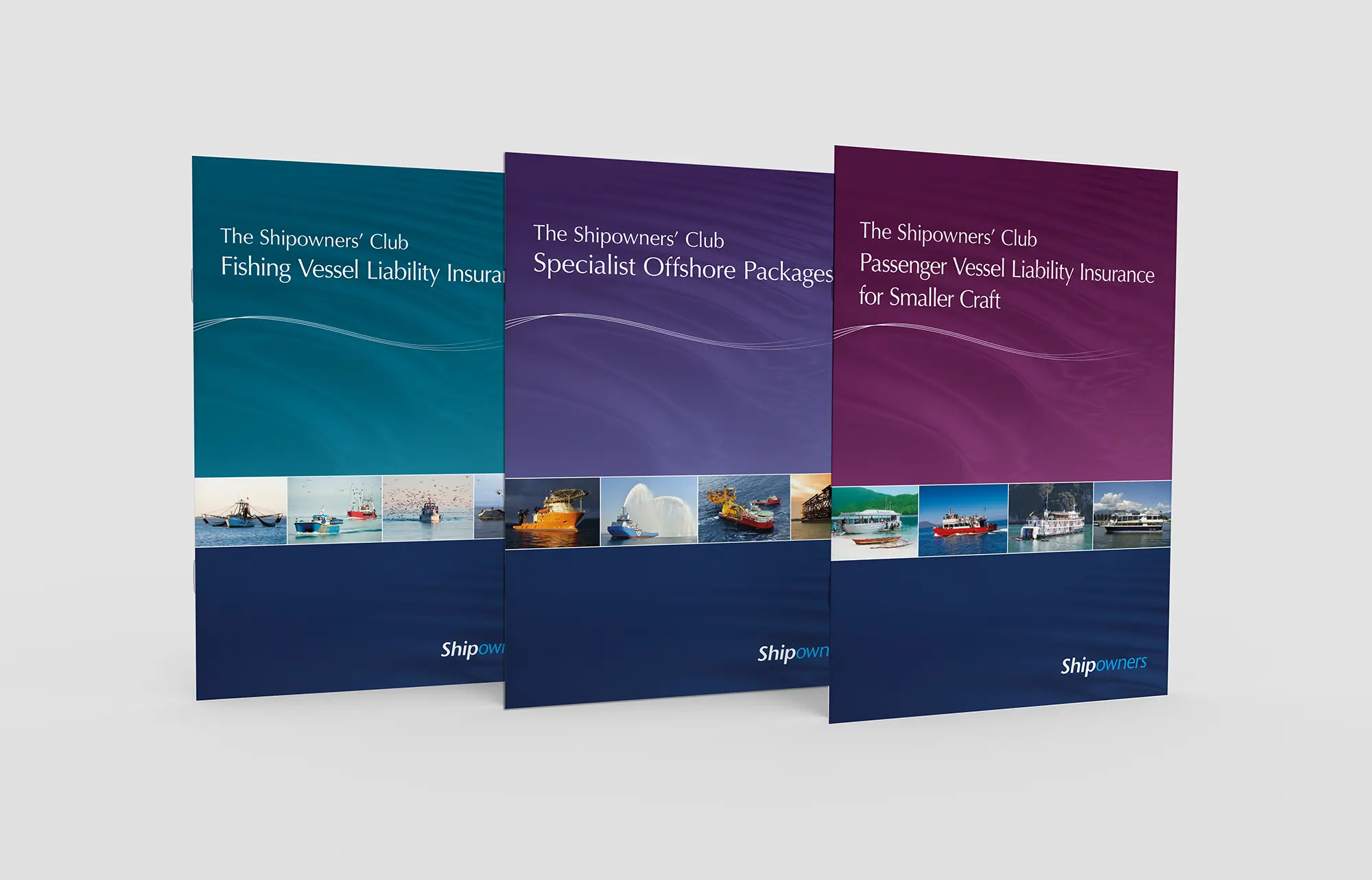
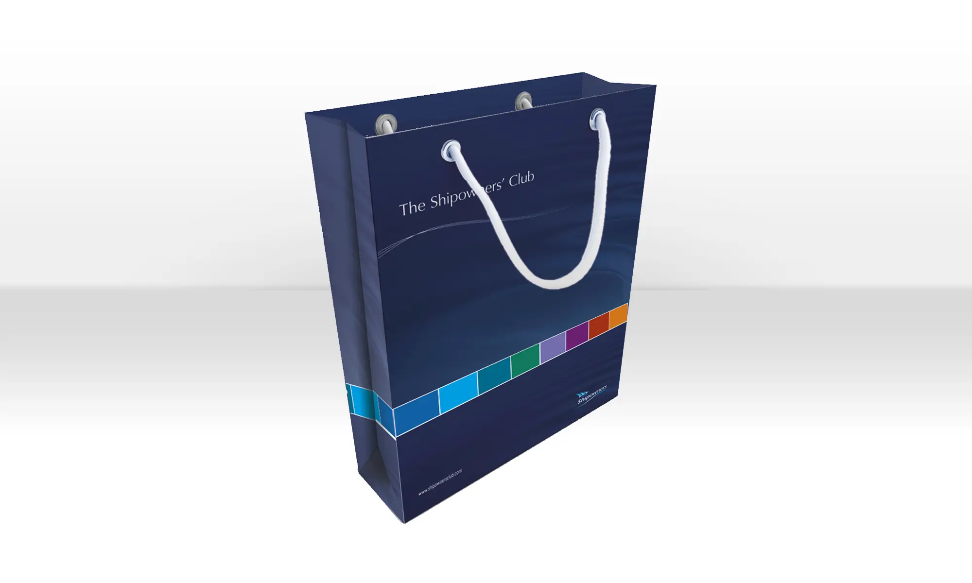
We crafted a future-proof brand identity that honoured the Club’s heritage while positioning it for ongoing relevance. Our team developed a timeless logo that reflected the Club’s trusted reputation and professionalism. This logo also offers flexibility for long-term use.
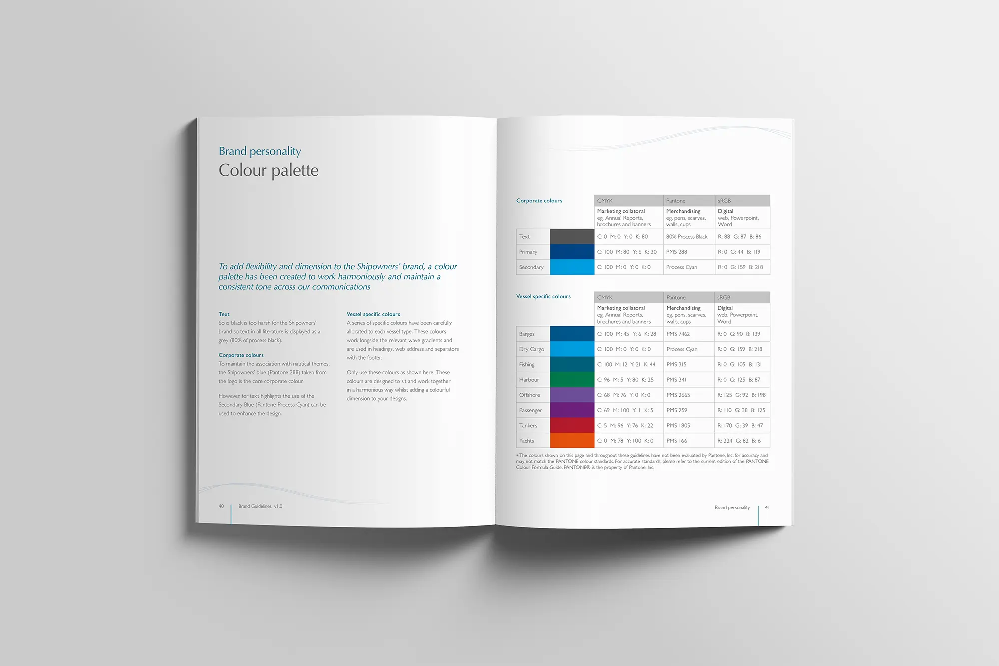
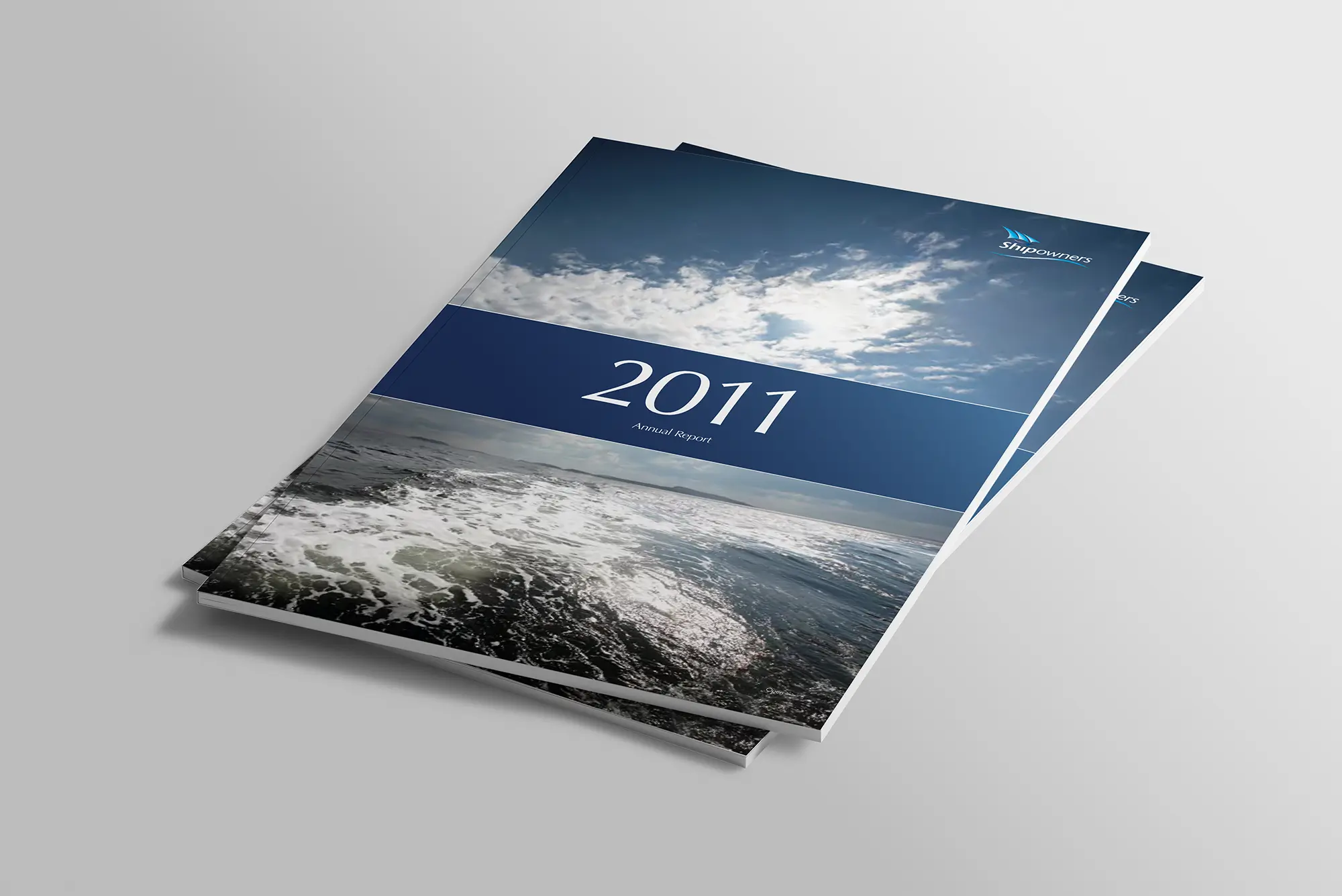
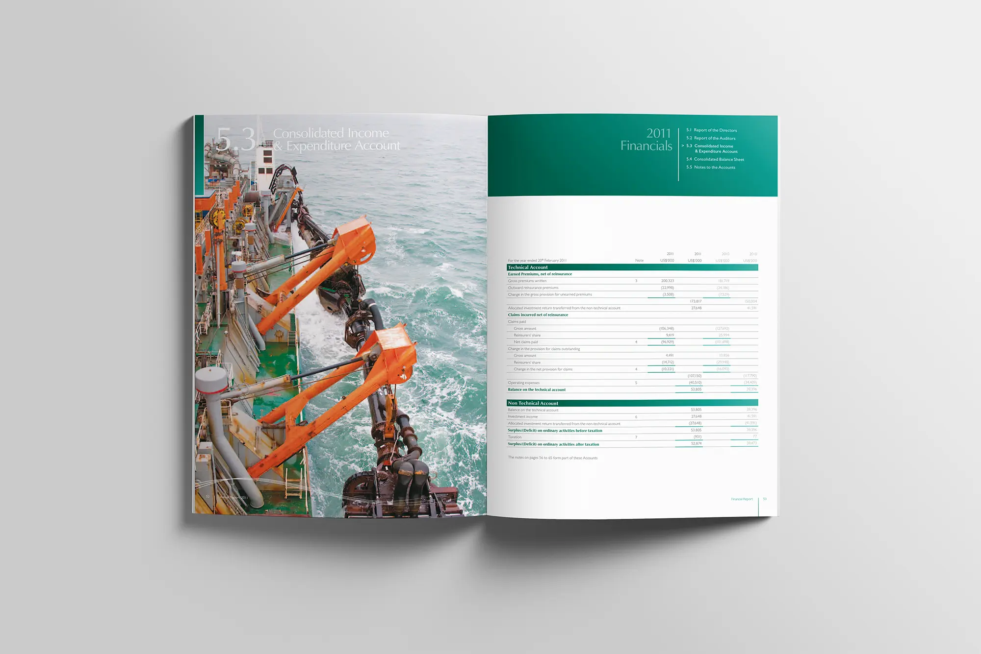
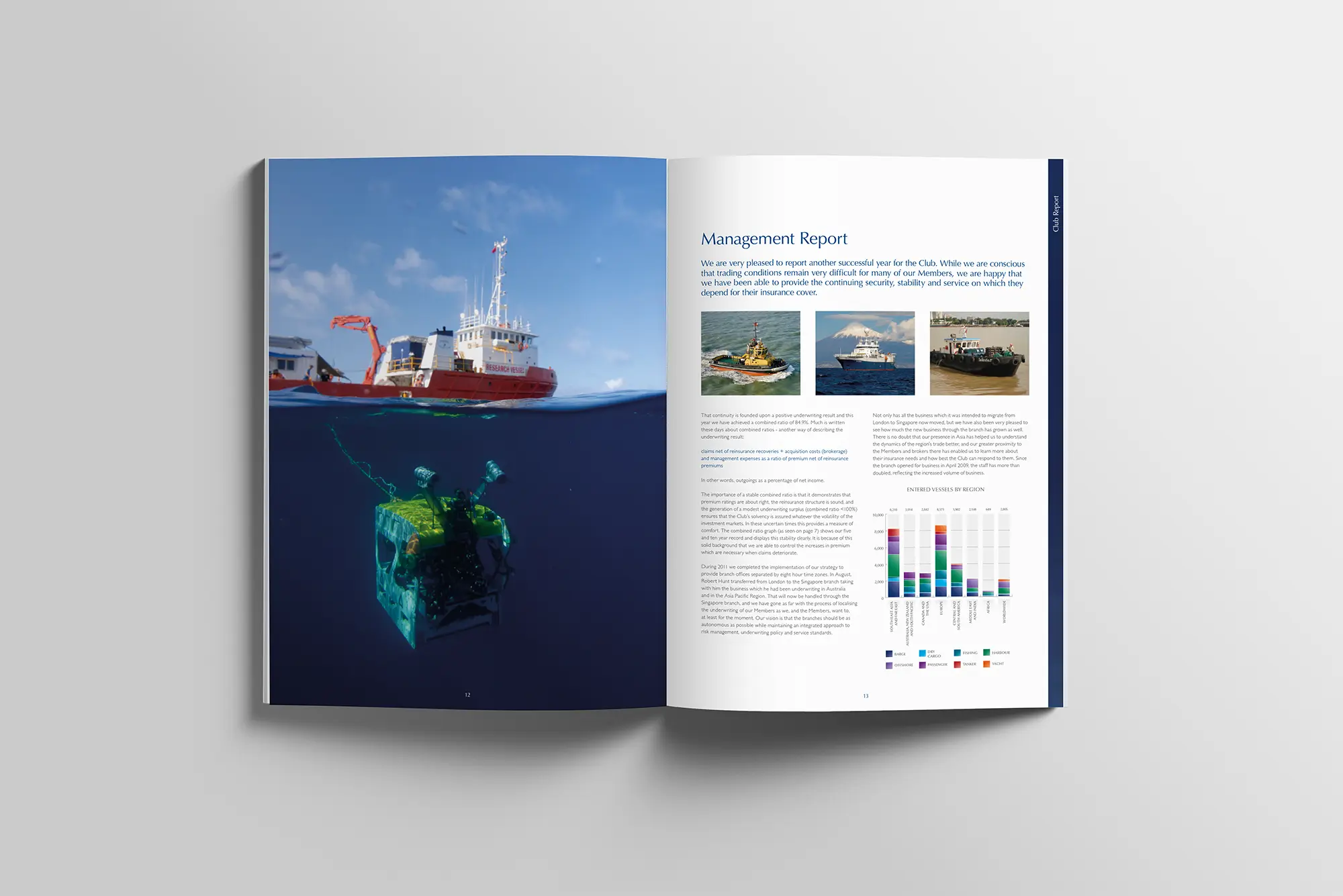
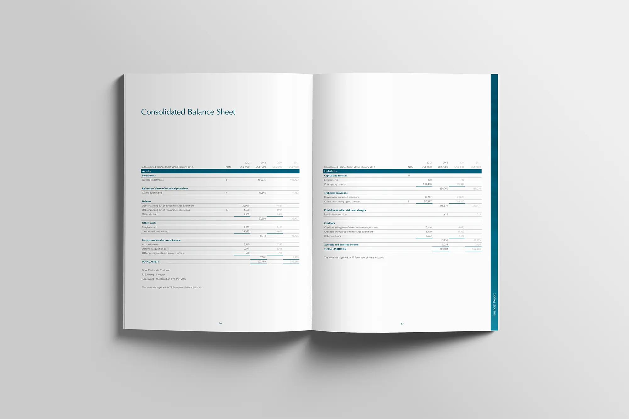
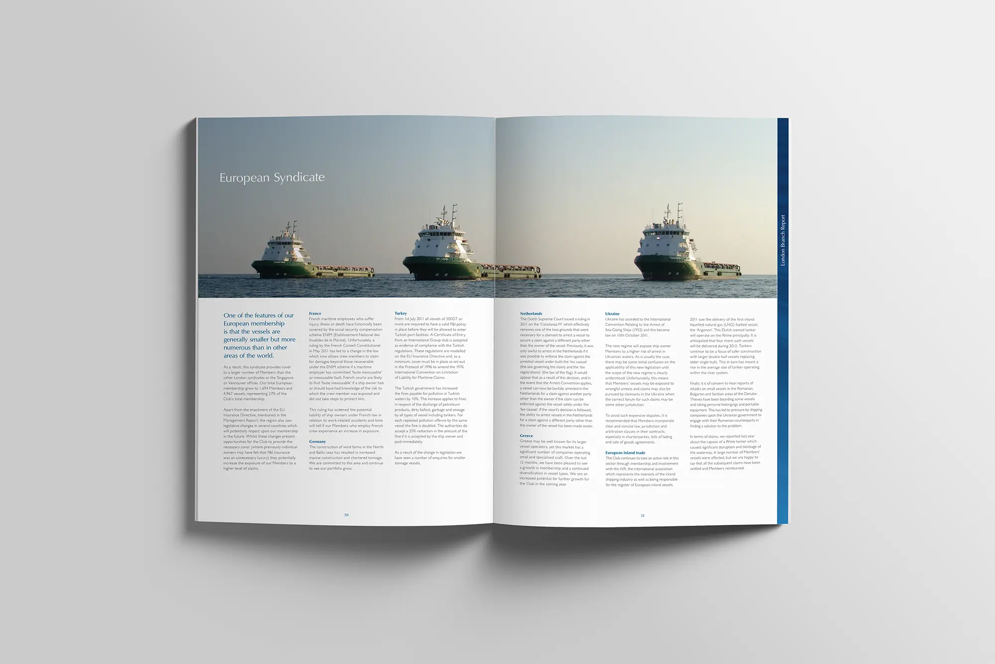
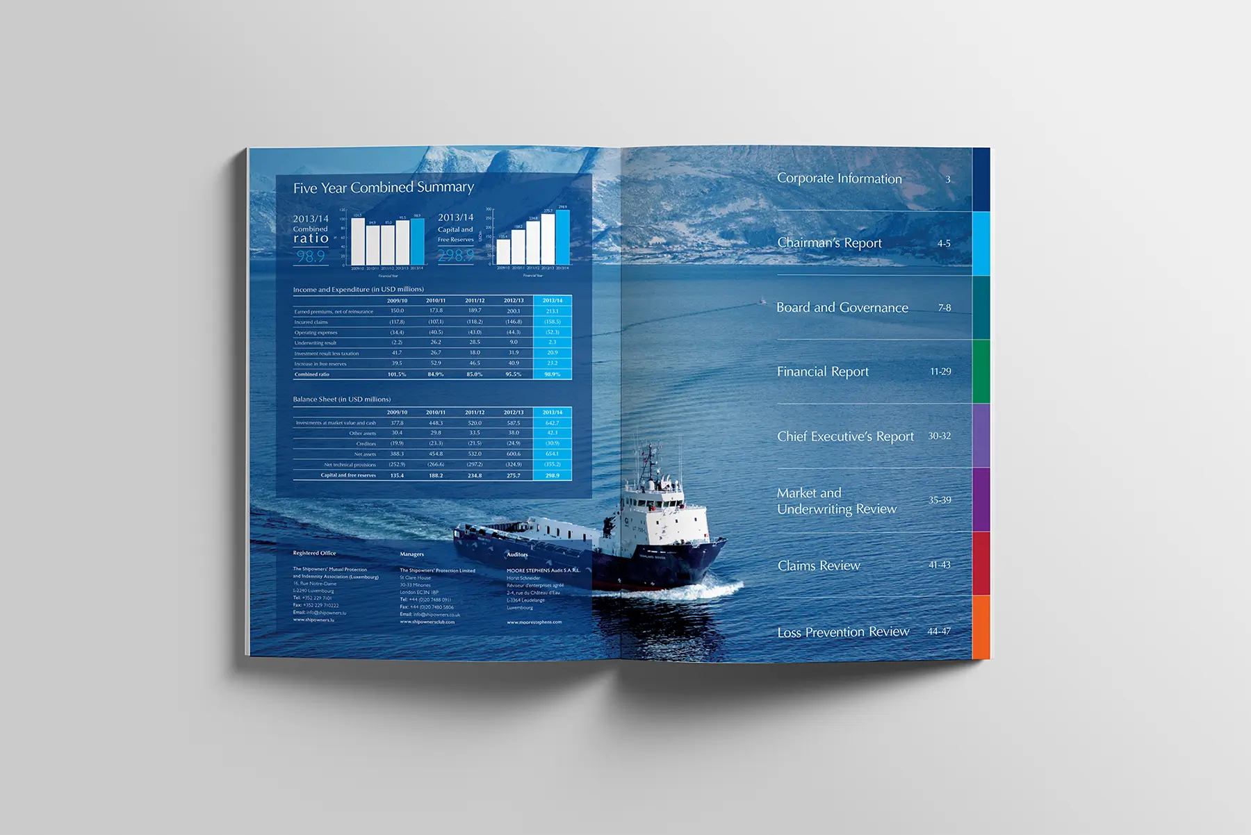
We established comprehensive brand guidelines. These included updated typography, a refined colour palette, and a graphic language applied consistently across all communications, both digital and print. We modernised existing publications to ensure a cohesive, fresh brand experience at every touchpoint.
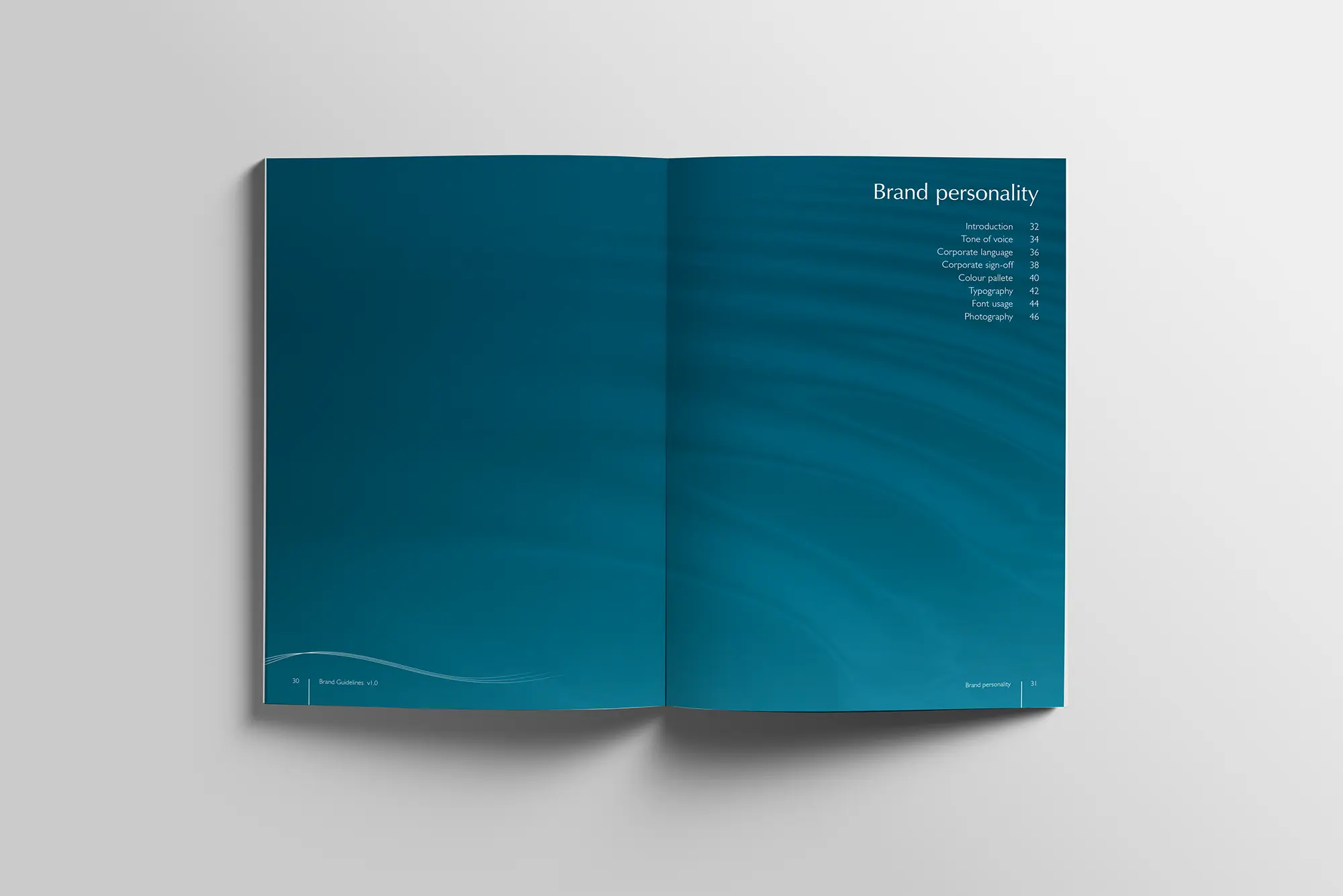
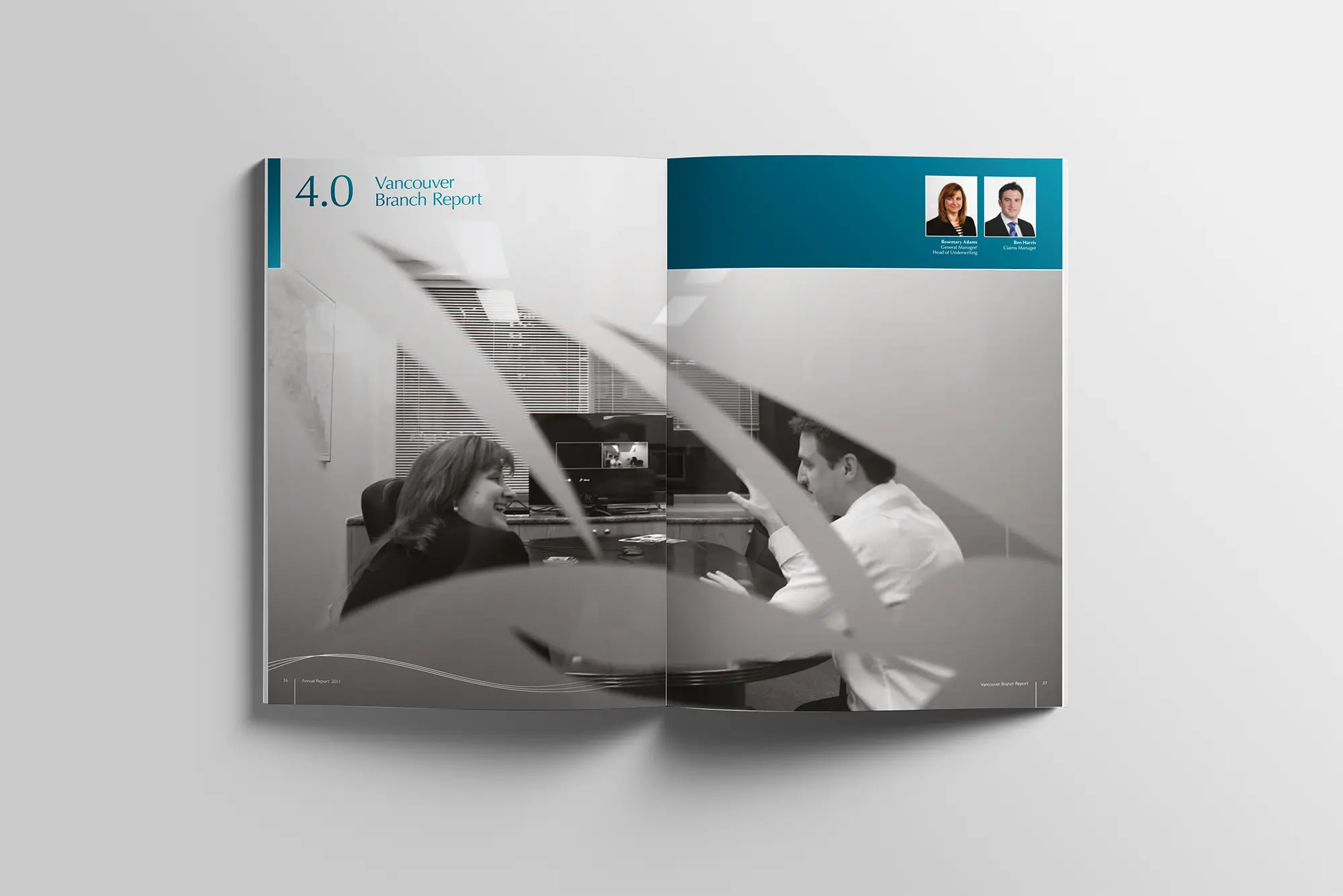
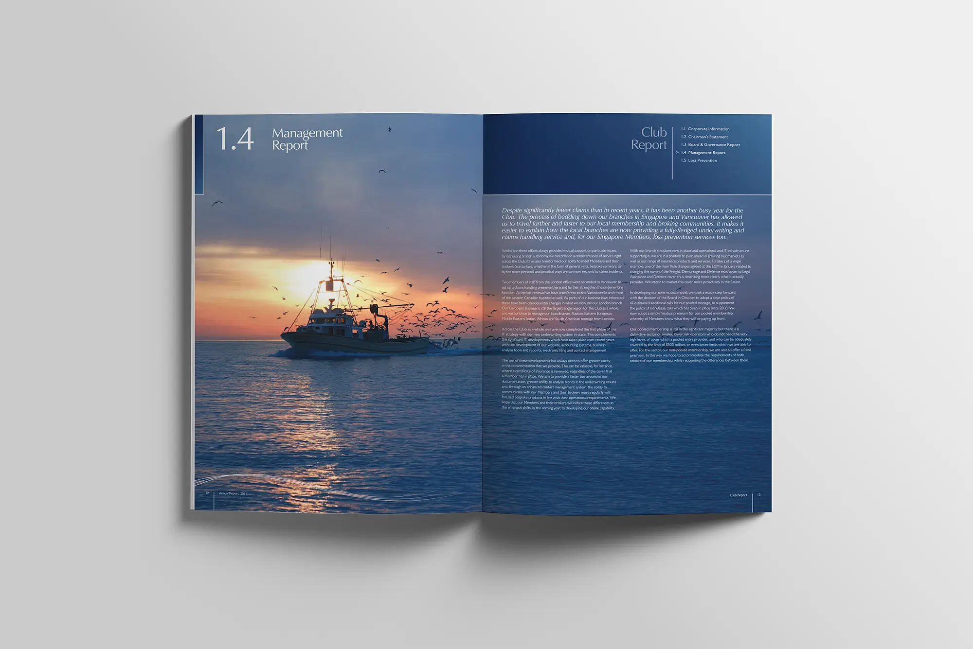
A distinctive ripple graphic symbolises the Club’s far-reaching impact across global waters. Designed with flexibility, this motif adapts to covers, backgrounds, and digital formats. A delicate white wave graphic acts as a subtle page break or divider. It adds depth and movement to layouts without overpowering the content.
We used space and negative space deliberately to let typography and messaging breathe. This approach reinforces clarity, authority and a calm professionalism.
To explore professional brand refresh services that can elevate your identity, please visit our brand identity services page for more information.