The Brief
WarmRed Creative created a bold, modern HR publication design to break away from traditional HR magazines. The client wanted a fresh identity that would clearly stand out. They needed a concept that respected readers’ busy schedules, delivering content that is intelligent yet quick to absorb. The design uses plenty of white space, which helps readers focus on dense editorial material without feeling overwhelmed. Moreover, the tone reflects the trusted authority of backers Croner and PricewaterhouseCoopers. At the same time, it appeals directly to senior HR professionals who seek meaningful insights. This balance was essential to position the publication as a leader in the HR space.
Design Approach
Our approach to this HR publication design focused on clarity and engagement. We crafted a modern design system with a clean typographic hierarchy and a structured grid. By using generous white space, we gave complex content room to breathe. Consequently, readers found lengthy articles easier to follow and less intimidating. Since time is valuable for the target audience, the layout remains confident yet light, helping them navigate efficiently.
We also created the name ‘Hourglass’ as a strategic element. It plays on a predictive text quirk where “HR” auto-corrects to “Hourglass.” This clever touch links the concept to time and value, signalling that spending just an hour with the publication brings valuable HR insights.
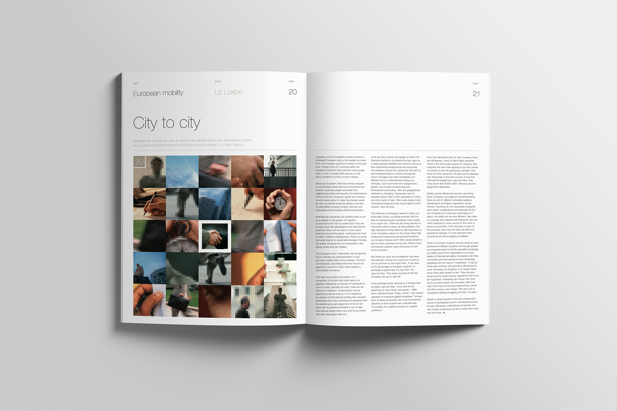
The launch issue covered a wide range of topics, from executive mobility in Europe to cultural integration in multinational firms. It also explored new ideas about human capital and risk. We presented the editorial with sharp, precise writing, paired with a calm and intelligent visual style. Overall, this design elevated the publication as a credible, compelling voice in the HR world.
Throughout the project, we aimed to deliver an HR publication design that combines aesthetic appeal with practical usability. To learn more about how we create impactful looking brochures and magazines, visit our brochure design services page.