The Brief
London Capital Holdings (LCH) consisted of four interconnected companies delivering a comprehensive, high-end property service across central and West London. Their operations covered the full lifecycle of property development: from identifying investment opportunities and managing bespoke design and construction, to overseeing sales, lettings and long-term portfolio growth.
Each subsidiary focused on a specific function:
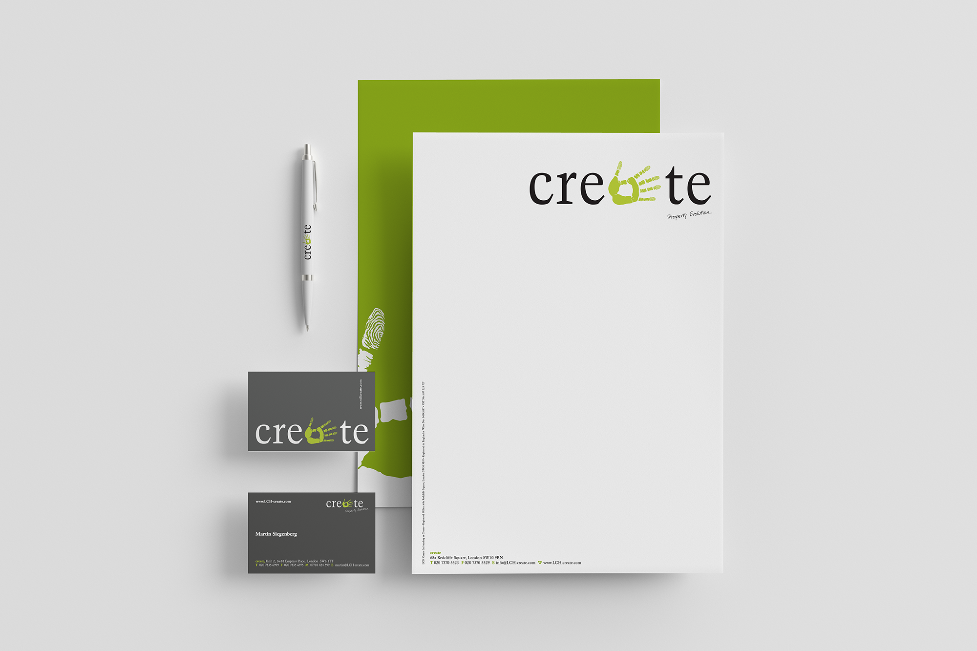
Create: A fully integrated design and build company delivering exceptional residential properties. This included a 20-person construction team and a dedicated architectural design studio.
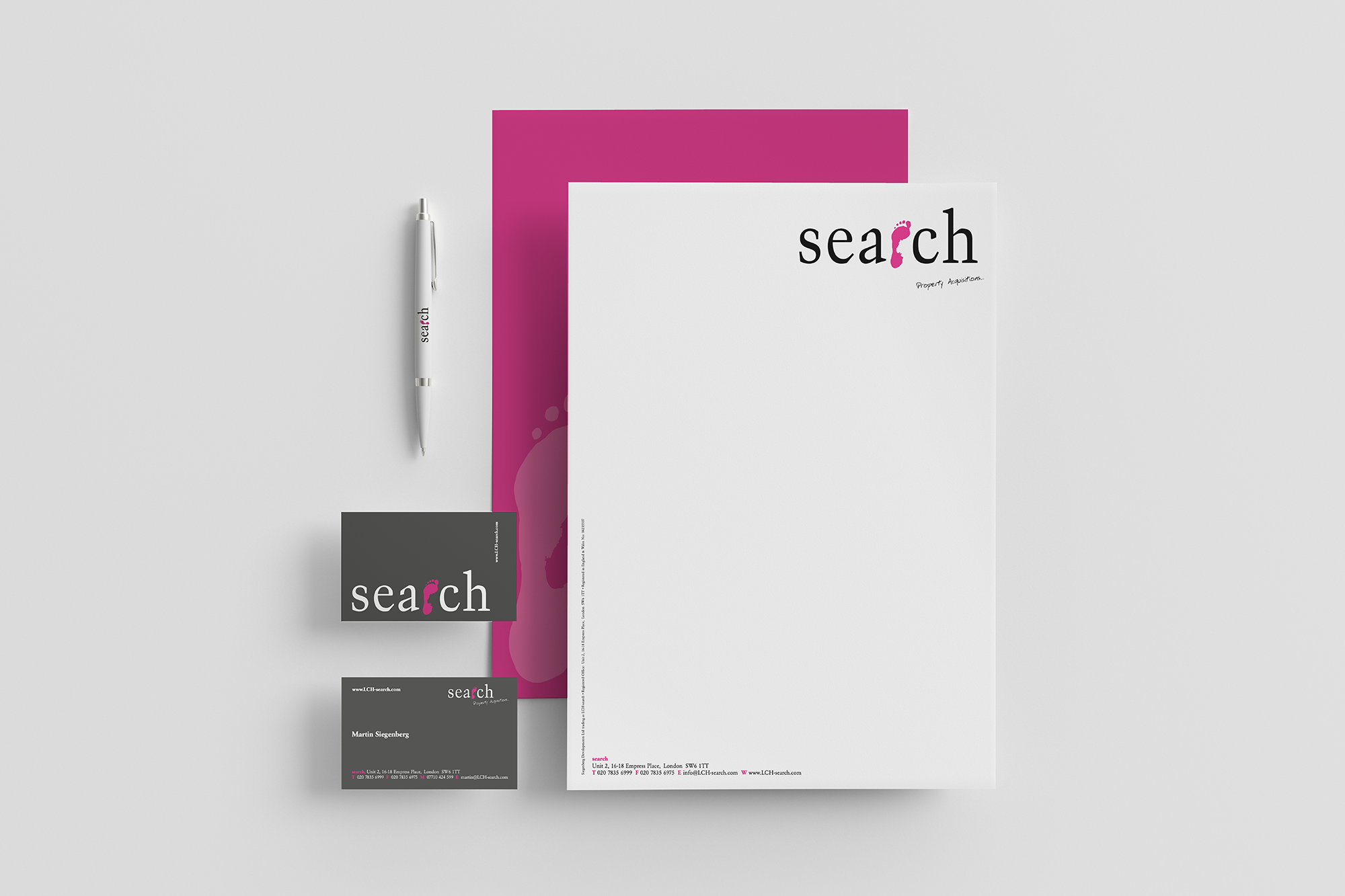
Search: A specialist consultancy sourcing prime investment opportunities for private clients, developers, and homeowners.
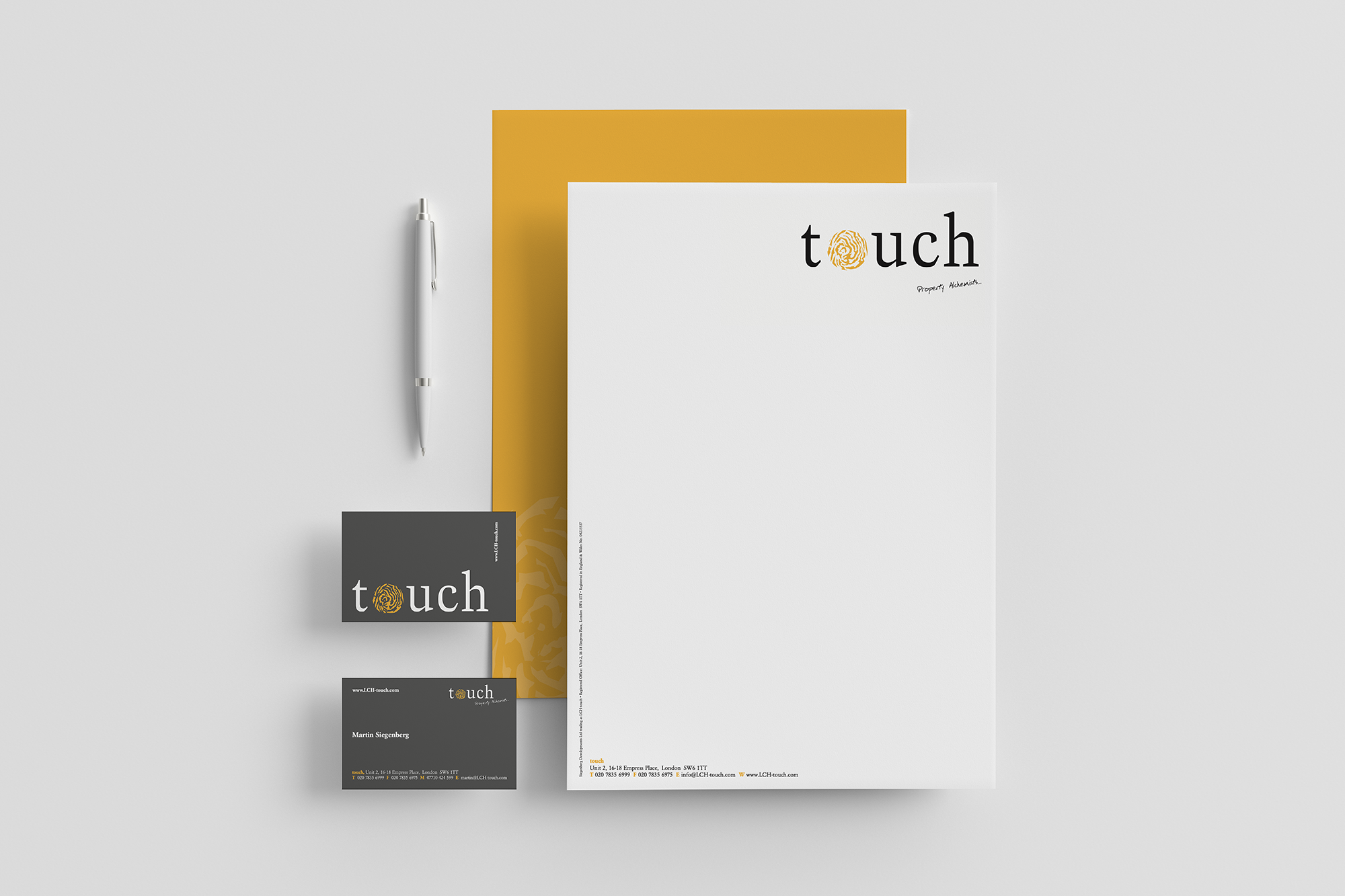
Touch: The in-house development and funding arm, handling independent and joint venture projects, plus managing a significant West London property portfolio.
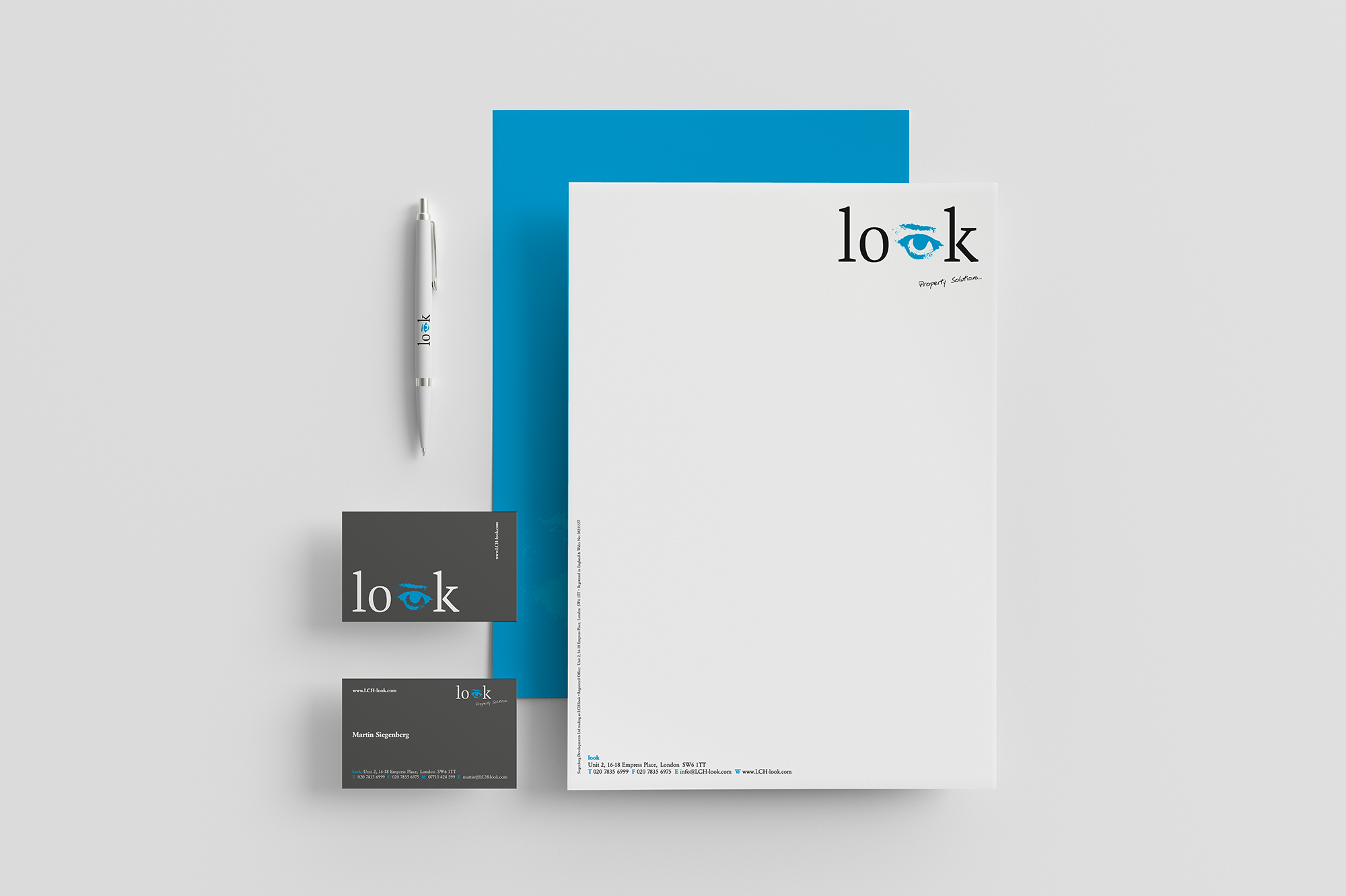
Look: A marketing and estate agency service providing tailored support for sales and lettings, with a particular focus on the Kensington & Chelsea market.
Because LCH wanted a single, unifying identity to bring these four specialist services together under one brand umbrella, it also needed to let each service address its own audience and purpose. The goal was clear: wherever the brand appeared — on-site, online, or in print — it had to be instantly recognisable, cohesive and reflective of the group’s high standards.
Design Approach
The key challenge was to build a strong visual identity that united four different companies, each playing a unique part in the property journey, into one cohesive brand. To achieve this, I started by deeply understanding each division’s character and function.
I created a set of bold, symbolic icons to express their individuality while ensuring brand unity:
Create was symbolised by a hand, reflecting craftsmanship and the hands-on nature of construction.
Search was represented by a foot, evoking movement and exploration.
Touch used a thumbprint, symbolising identity and personal investment.
Look featured an eye, standing for vision and detailed attention in marketing and sales.
Each icon paired with a bright, primary colour to give every company a distinctive presence, while the palette worked together to create a fresh, confident group identity. The colours helped visually separate the services, while reinforcing the overall brand’s energy and professionalism.
Moreover, the final identity system became bold and flexible. As part of this, we developed 4 sets of stationery designs that presented each brand individually whilst clearly part of a bigger brand vision.