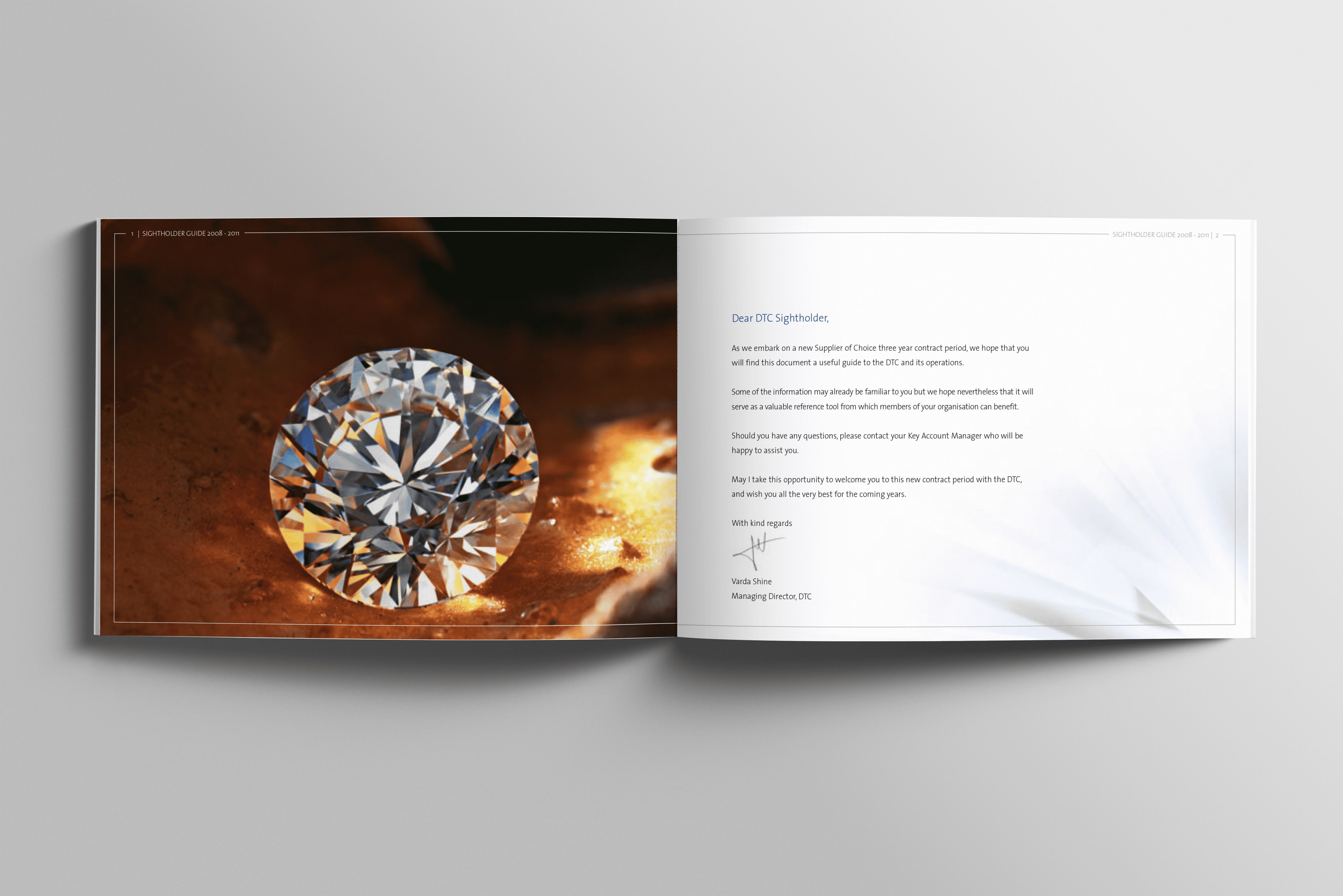
The Brief
De Beers’ Diamond Trading Company (DTC) tasked us with creating a bold new visual identity. The goal was to position them as the world’s most sustainable and trusted source of uncut diamonds.
The brief focused on reinforcing DTC’s leadership — not only in scale and heritage but also through values, innovation, and sustainability. We aimed to communicate this clearly and confidently to their exclusive audience: the Sightholders.
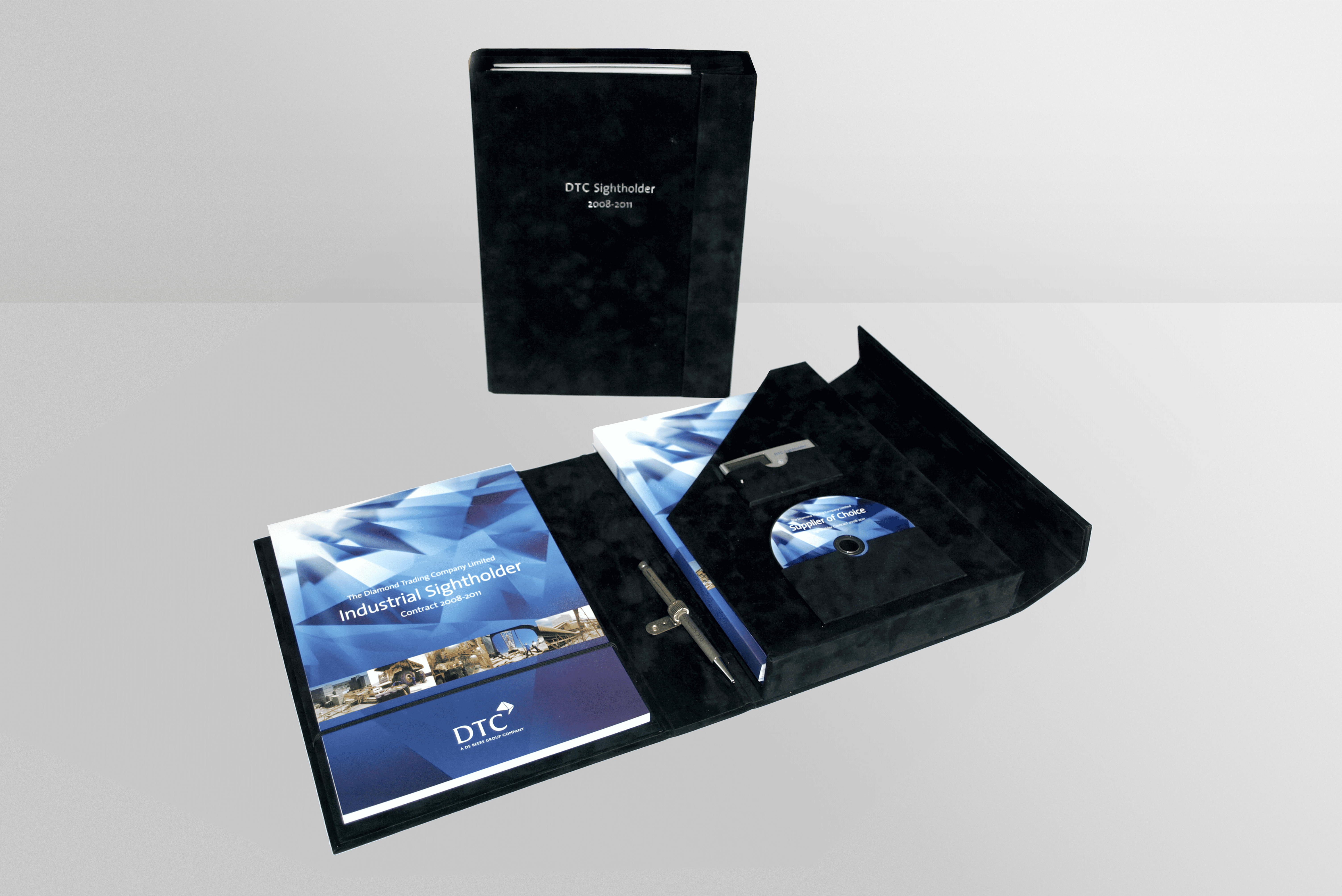
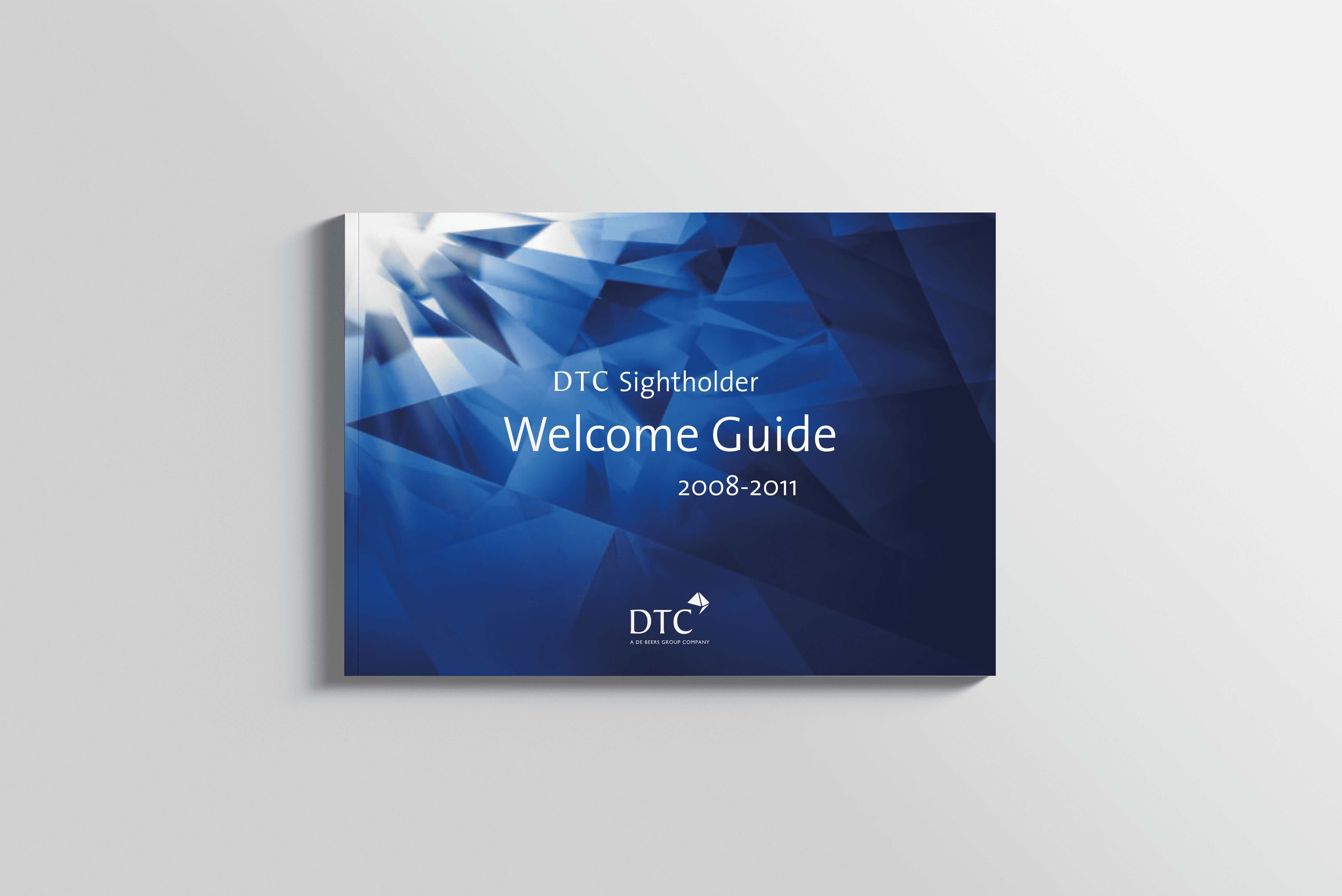
Sightholders form a select group of elite diamond traders with privileged access to the finest rough diamonds. Each year, they receive exclusive materials—from official contracts to detailed brochures—crafted to reflect this prestige.
Our challenge was to develop a premium brand identity design that conveyed trust, quality, and modern ethical values. The identity had to work seamlessly across print and physical touchpoints, ensuring a cohesive experience from the first handshake to the final stone.
Design Approach
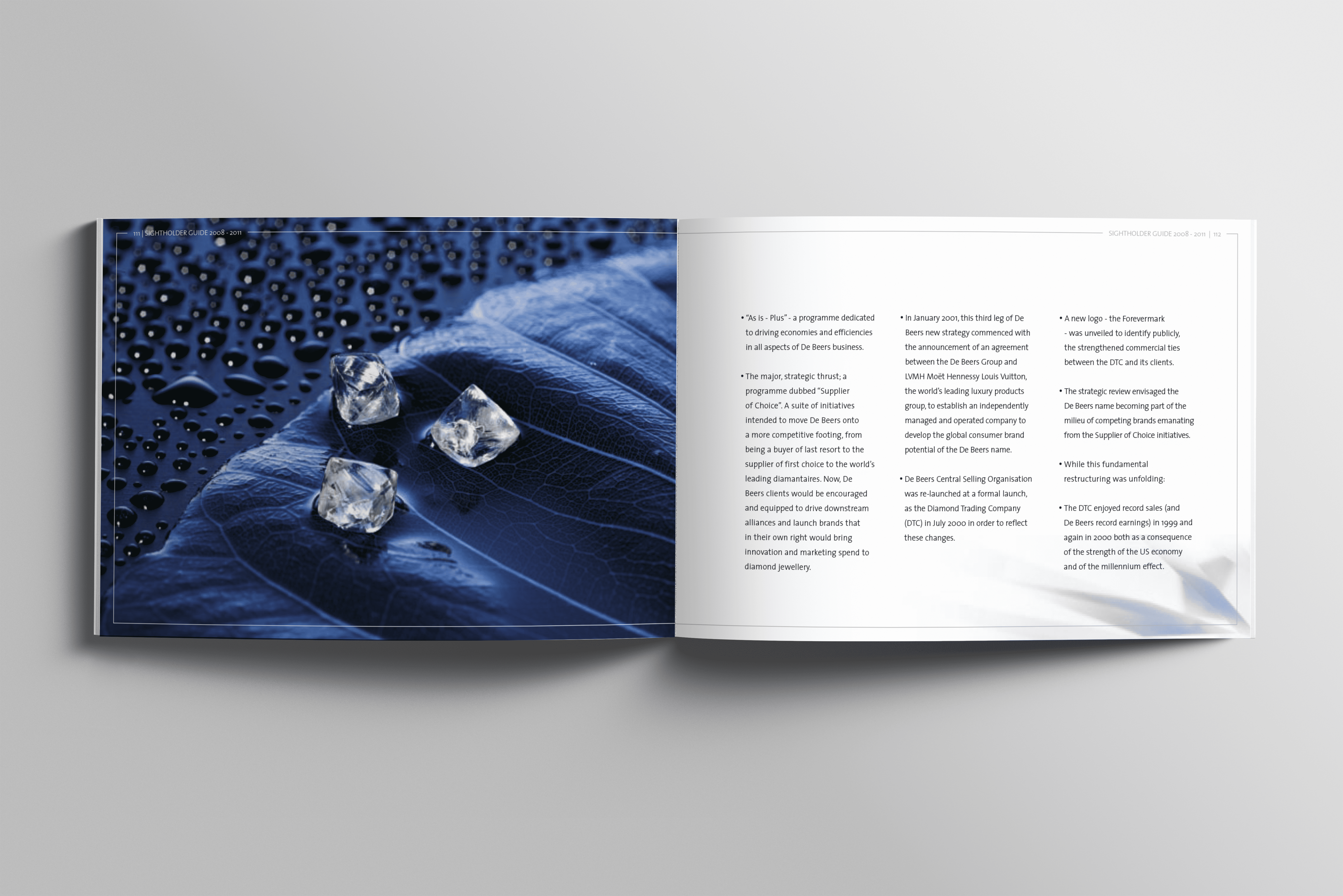
We began our creative journey with an immersive visit to De Beers’ diamond vaults in Farringdon. This experience inspired the new identity’s core concept, based on the cutting process where one rough diamond becomes two brilliant stones.
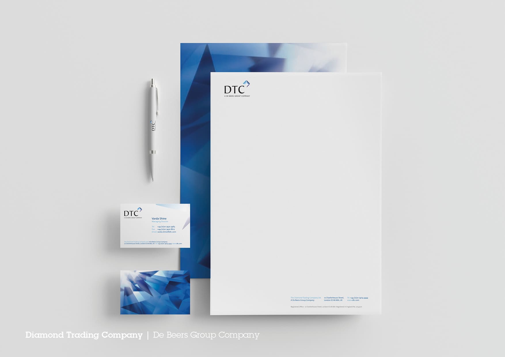
The logo features two symmetrical cut diamonds within the outline of an uncut stone, symbolizing precision, duality, and hidden value. Positioned at the top right of the DTC logotype, it adds harmony and suggests progress and refinement.
To evoke luxury and depth, the icon uses a bespoke gradient of blue and purple hues, reflecting the diamond’s natural light refraction.
We complemented the core identity with a supporting graphic element called ‘The Shining Light.’ This faceted, redacted image represents brilliance and clarity and appears consistently across all communications, always with its brightest point in the top-left corner, symbolizing a natural light source.
To ensure consistent application, we developed comprehensive brand guidelines covering every touchpoint.
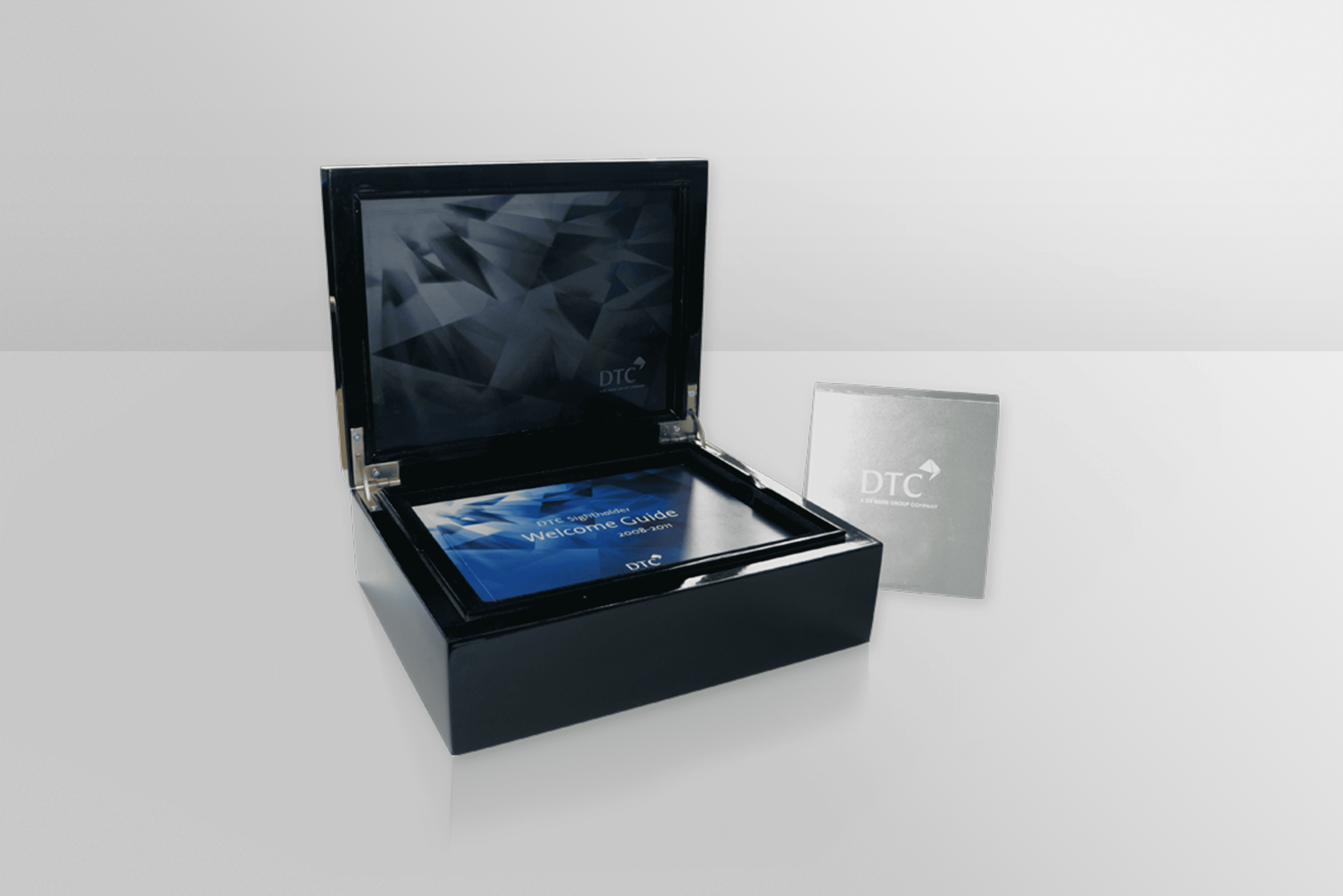
The highlight of the rollout was a bespoke black lacquered presentation case for DTC’s Sightholders. Inside, a precision-cut glass divider featured a laser-etched version of ‘The Shining Light,’ alongside printed brochures, contracts, and a custom-engraved metal glass loupe—a symbol of trust and craftsmanship.
From high-end print materials to tactile brand experiences, every element was crafted carefully to express modern prestige. This premium brand identity design firmly re-established DTC as the most trusted name in rough diamond trading.
Learn more about our premium brand identity design services.