The Brief
Our goal was to create a cohesive and future-proof brand identity. It had to align with the organisation’s values, tone of voice, and growth ambitions. To achieve this, we developed a comprehensive brand style guide. Additionally, we created a targeted recruitment advertising campaign and internal communications assets—such as motivational or culture-led stickers—to boost internal engagement and consistency.
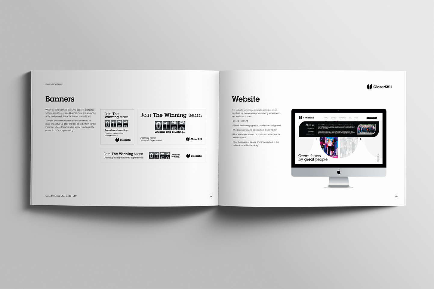
Moreover, the brand needed to be versatile across digital and print touchpoints. It had to remain clear, recognisable, and adaptable for both external and internal audiences. Recruitment materials aimed to attract top talent by clearly communicating the company’s purpose, benefits, and culture. Meanwhile, internal communications were designed to inspire pride and unity among staff.
Design Approach
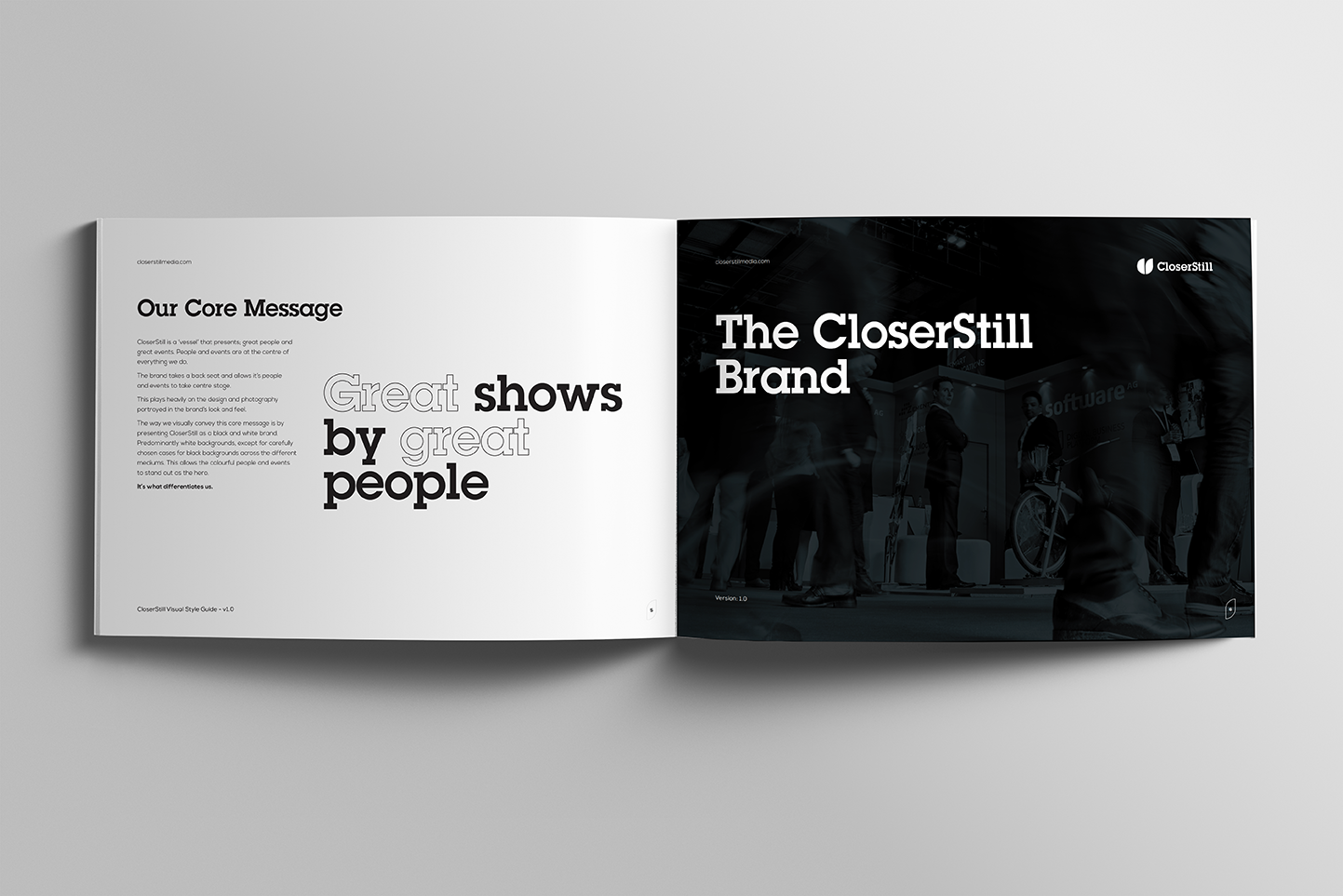
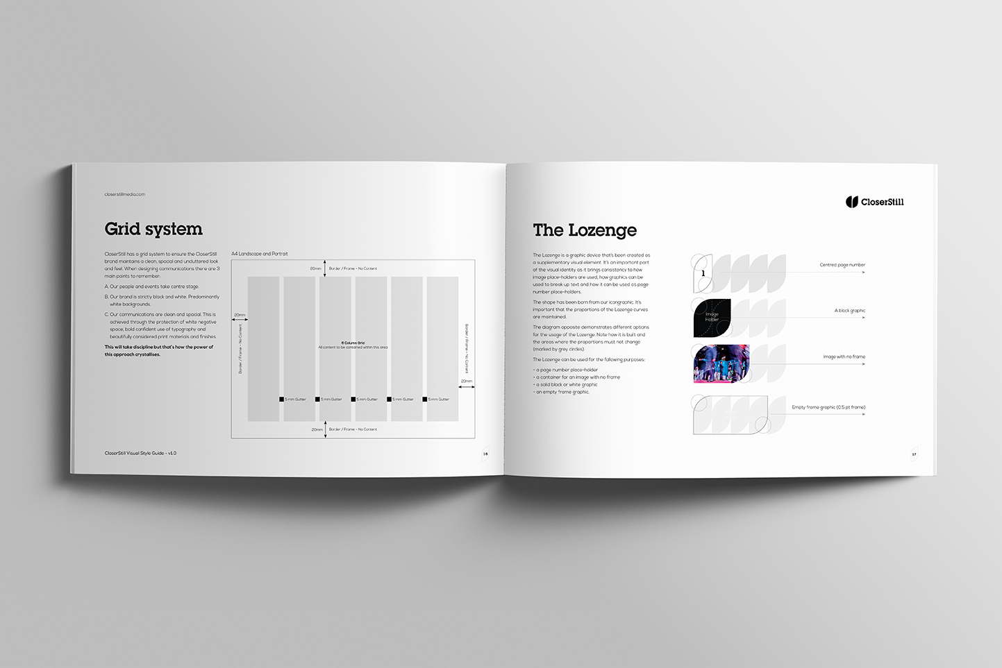
First, we defined the brand’s core principles: its values, visual language, and tone of voice. Then, we translated these into a flexible yet distinctive identity. The result was a black-and-white master brand—confident, modern, and deliberately minimal. This approach allows individual shows and events to provide colour, energy, and personality.
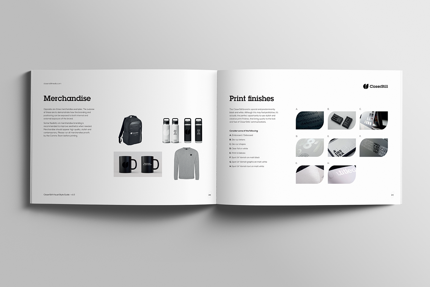
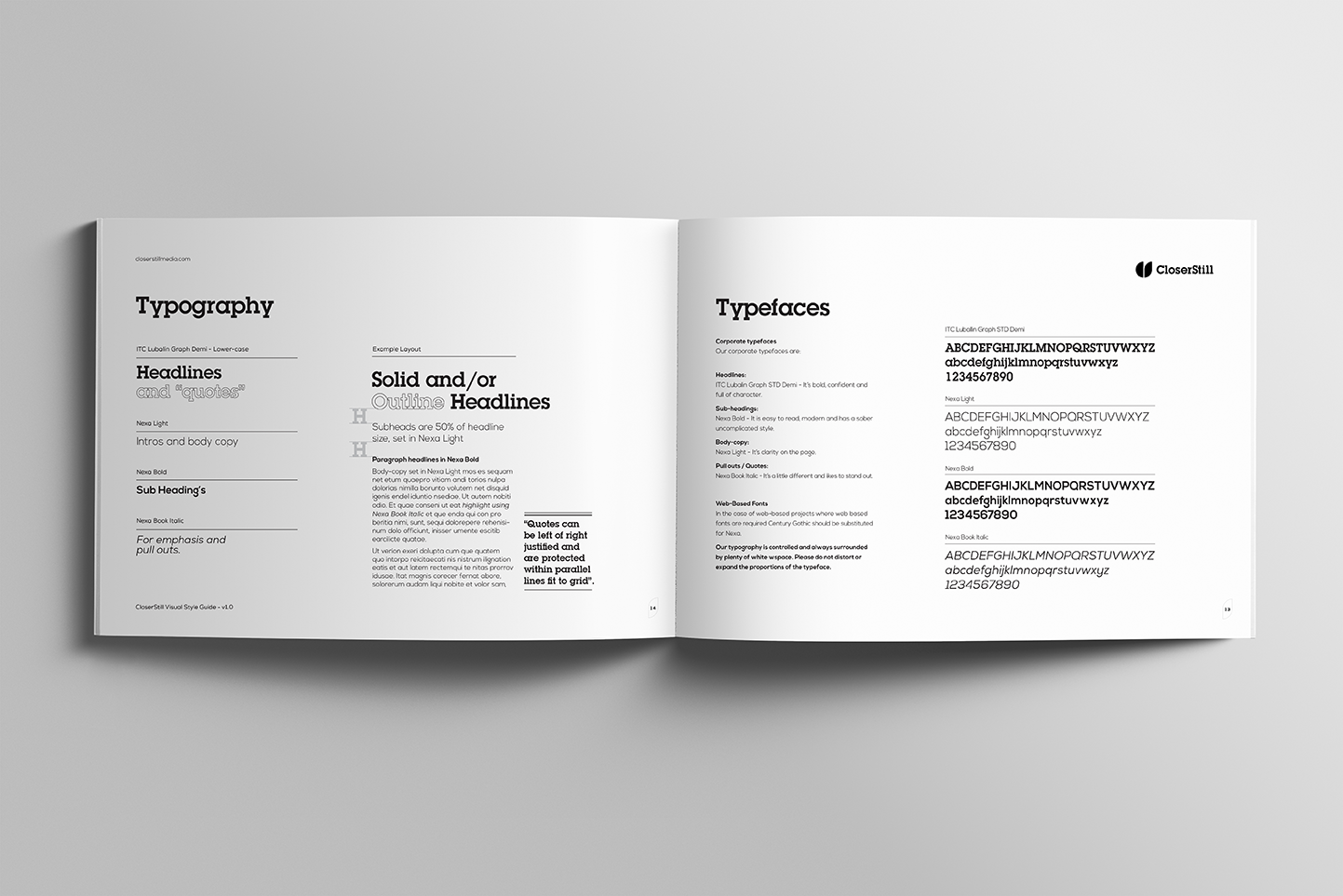
The brand style guide covers logo usage, typography, monochrome palettes, graphical treatments, image use, and tone of messaging. This creates a strong foundation for consistency across all applications.
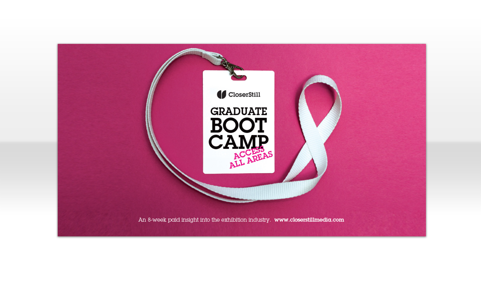
For recruitment advertising, we developed a striking creative campaign based on the simple image of a lanyard. This symbol is universally recognised as representing belonging and identity within an organisation. The lanyard acted as a visual metaphor. It suggested opportunity, individuality, access, and pride in the role. Importantly, this flexible motif helped communicate culture, community, and potential without relying on clichéd recruitment visuals.
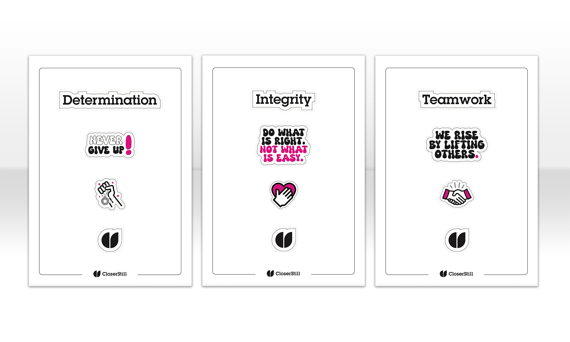
Internally, we created a series of black-and-white stickers for laptops, notebooks, and workspaces. These featured punchy one-liners and value-driven phrases to reinforce the brand’s voice and motivate the team. Designed to be informal and shareable, they form a small but visible part of a larger internal communications strategy.
Overall, the approach balances structure with adaptability. It builds a timeless, neutral brand system that supports vibrant campaigns while staying rooted in clarity, consistency, and purpose.
Learn more about how our logo design services can help craft a distinctive corporate brand identity that resonates internally and externally.