The Brief
DUCC wanted a complete rebrand to elevate its professional presence. They aimed to align their identity with the mission of promoting trade and investment between Denmark and the UK. The organisation recognised the need for a contemporary, polished look that reflects Danish design values — clean lines, simplicity, and considered detail — while remaining modern and approachable.
The primary goal was to create an identity that conveys professionalism and authority. At the same time, it needed to be flexible enough to serve diplomatic and corporate contexts. DUCC also sought to maintain relevance in a competitive business environment. This positioning would establish them as a trusted and forward-thinking partner for companies engaged in cross-border trade.
Budget played a critical role. Therefore, the design had to support cost-effective printing solutions without sacrificing quality.
Design Approach
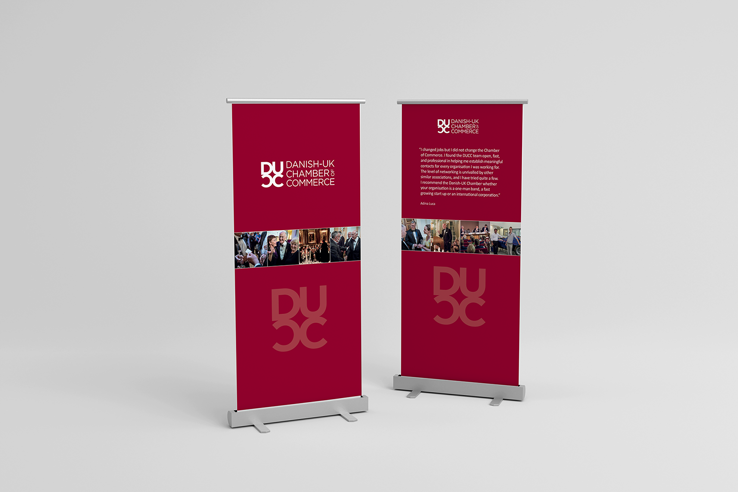
We worked closely with the DUCC board to craft a new visual identity. This identity encapsulates the organisation’s mission: promoting trade and investment between Denmark and the UK. The design reflects Danish values of simplicity, minimalism, and consideration. It also feels modern, professional, and adaptable for future growth.
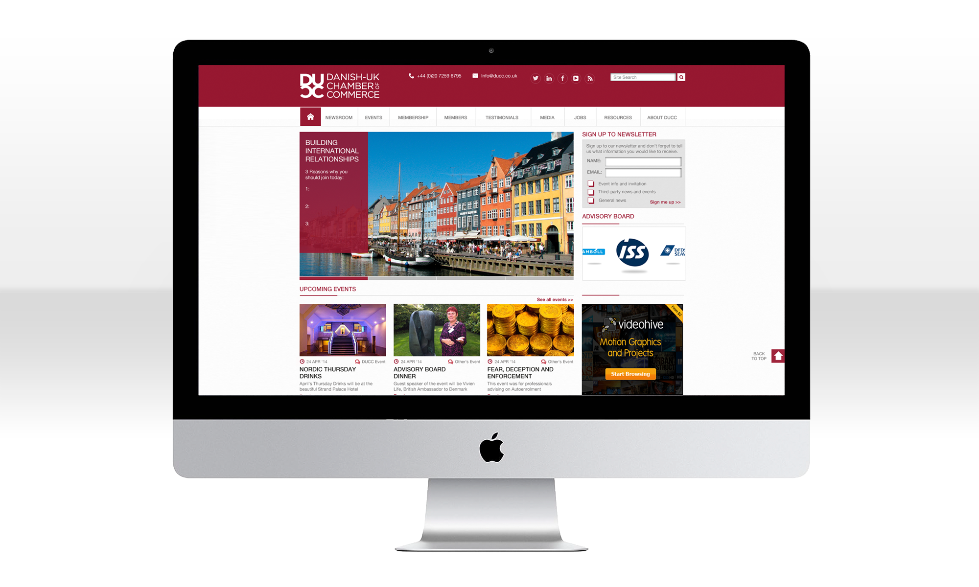
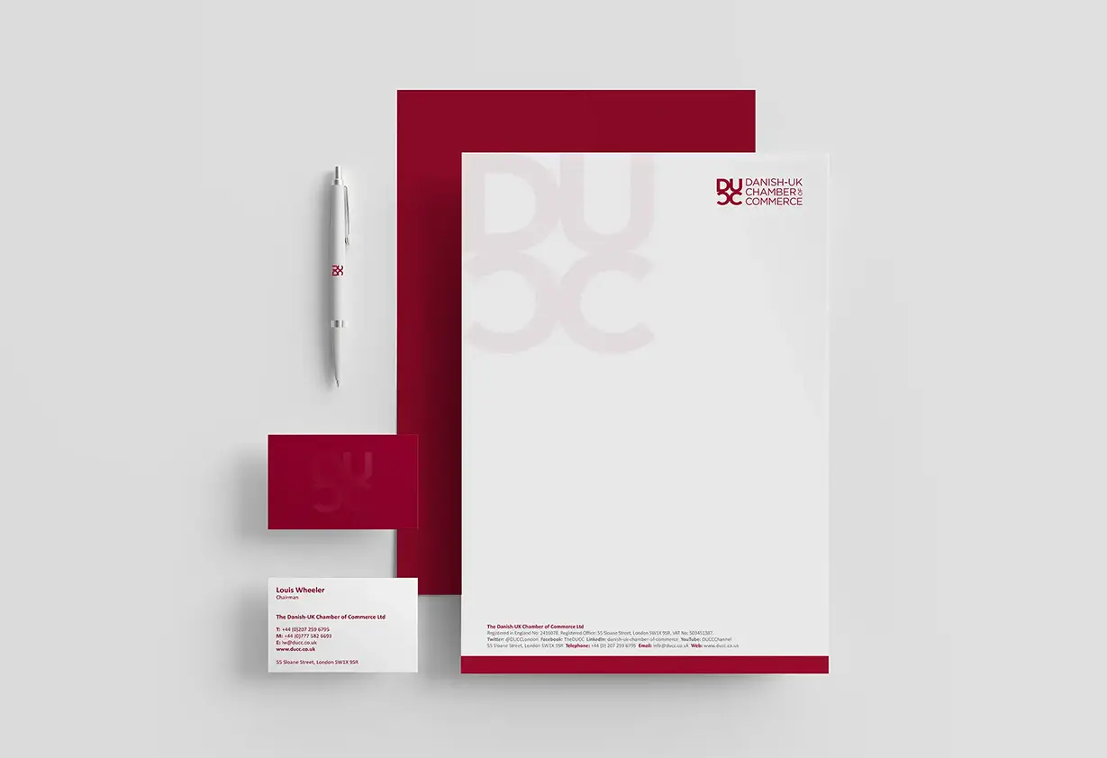
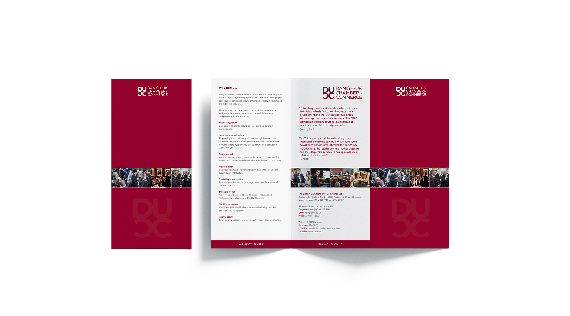
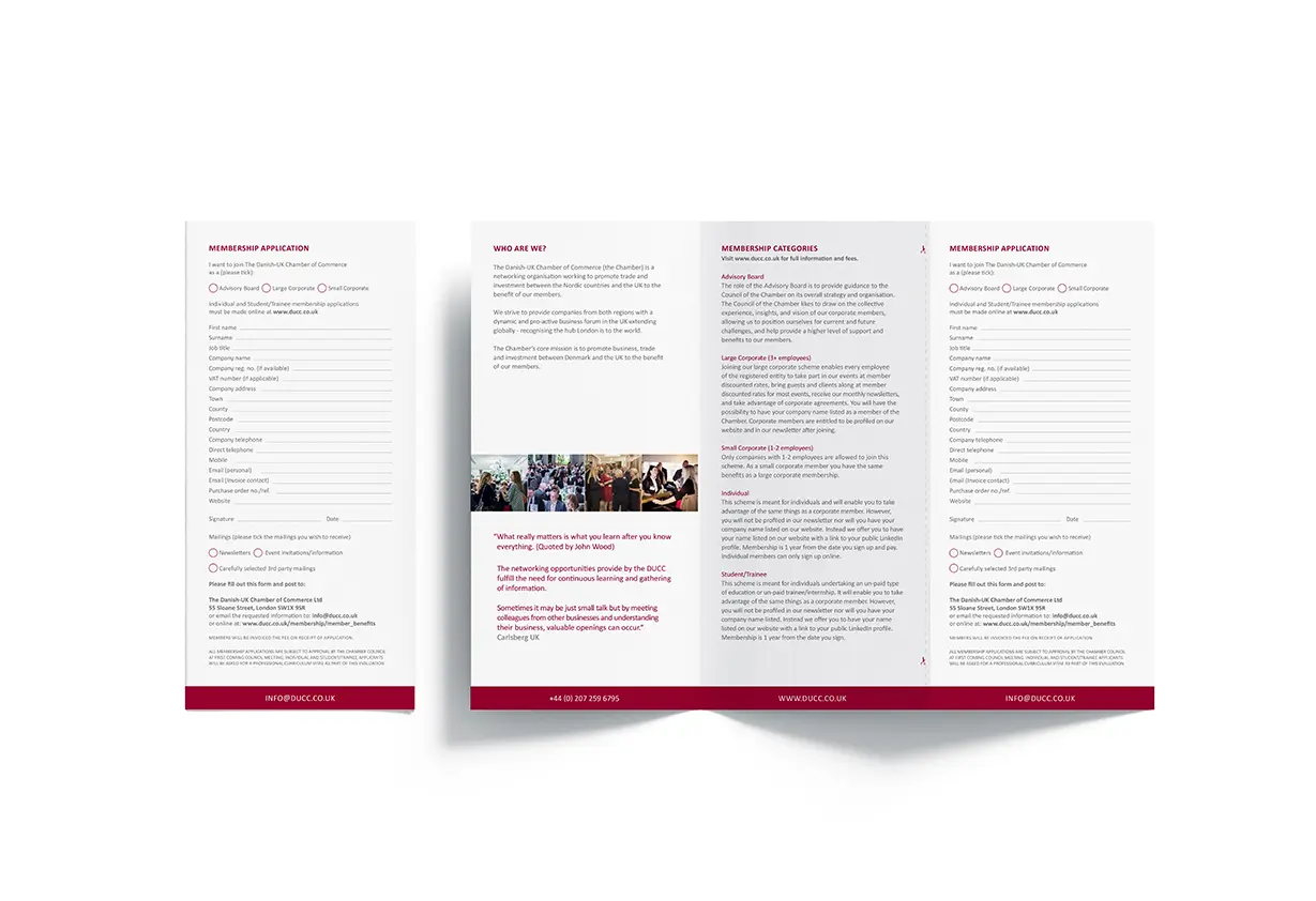
Our solution focused on a clean, geometric icon. It can stand alone or pair with the full name as a lock-up logo. This flexibility allows the brand to apply across various media—from formal event materials to digital platforms and official communications.
To meet DUCC’s budget needs, we designed the logo for single-colour use. This makes printing more cost-effective, especially for large volumes. Despite using one colour, the design maintains a polished, high-end feel. We chose premium print finishes to achieve this. For example, matt lamination creates a sophisticated, tactile experience, enhancing perceived quality. Additionally, spot UV varnish highlights certain design elements. This adds subtle but striking contrast, drawing attention to key features and elevating visual impact.
The result is a modern, professional identity rooted in Danish design principles. It offers a future-proof solution that stands the test of time. Furthermore, it conveys the organisation’s core values and works seamlessly across digital and print applications. By balancing budget efficiency with premium design, the branding strengthens DUCC’s reputation as a trusted, forward-thinking partner in the Anglo-Danish marketplace.
Explore how our logo design services can help establish a distinctive and professional brand identity for your organisation.