The Brief
A thriving dry cleaning business based in Bromley approached us with a bold ambition: to evolve from a single-location operation into a franchise-ready brand. Therefore, the founders recognised the need for a distinctive franchise branding design that would stand out in a saturated market, appeal to an urban, style-conscious clientele, and lend itself well to replication across multiple sites.
They welcomed a complete rebrand — including a name, visual identity, marketing materials, and branded customer experience — but required a solution that was both memorable and practical. Importantly, the franchise branding design needed to evoke high-quality service, professionalism, and cleanliness, while also appearing modern, characterful, and visually striking.
Design Approach
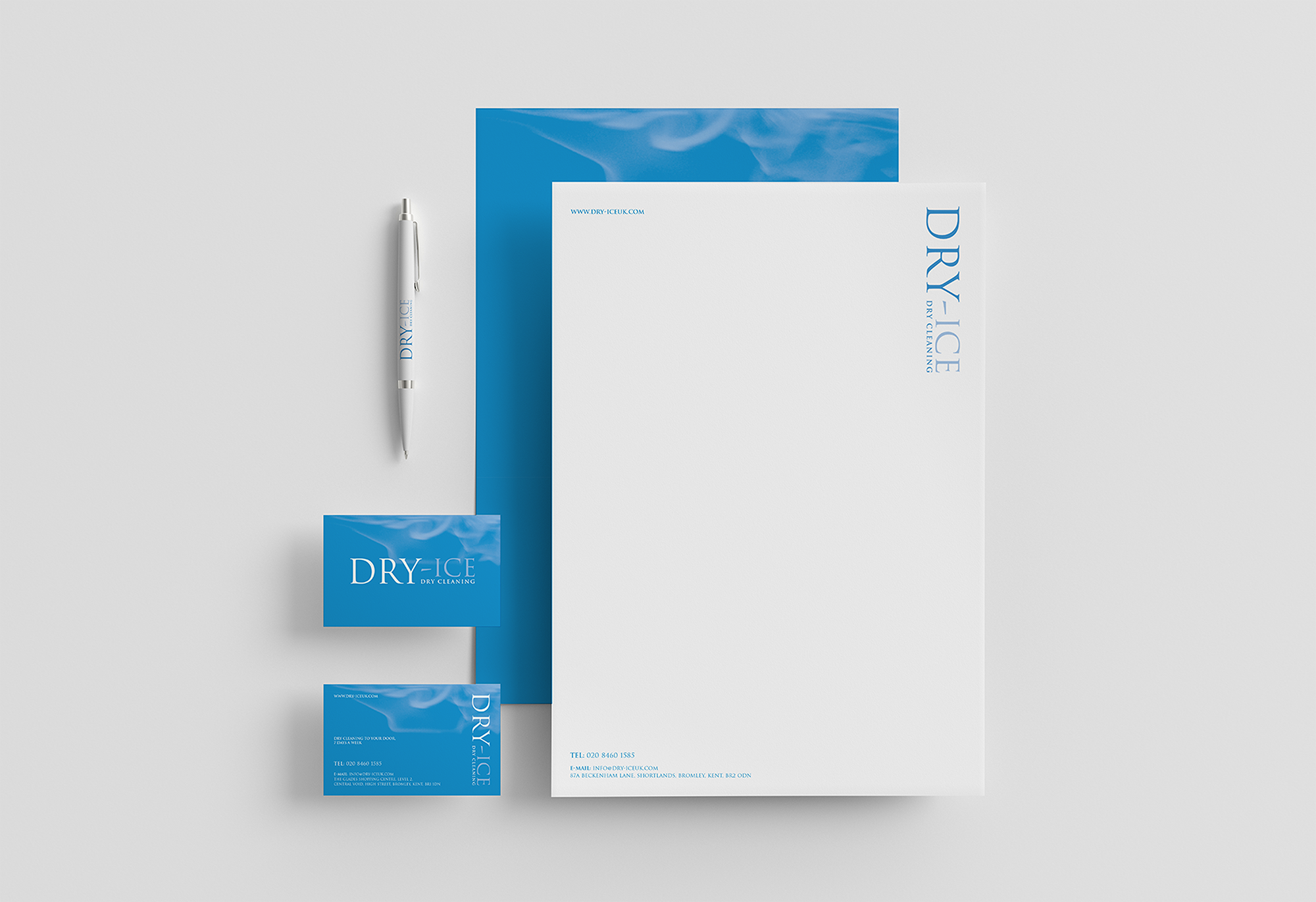
Our creative process began by immersing ourselves in the day-to-day business. By seeing behind the scenes, we discovered the meticulous care and precision behind their cleaning methods. This insight inspired the creation of the name Dry-Ice — a fresh, modern metaphor conjuring steam, vapour, and cleanliness that set them apart.
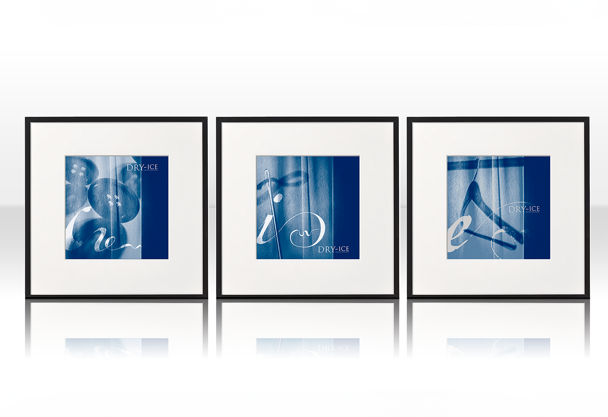
We crafted a bold, minimalist typographic logo — sharp and confident, yet balanced with softness — paired with a visual language centred on dry ice-inspired textures and atmospheric imagery. Moreover, the crisp palette of whites, charcoals, and vapoury silver evokes purity and sophistication.
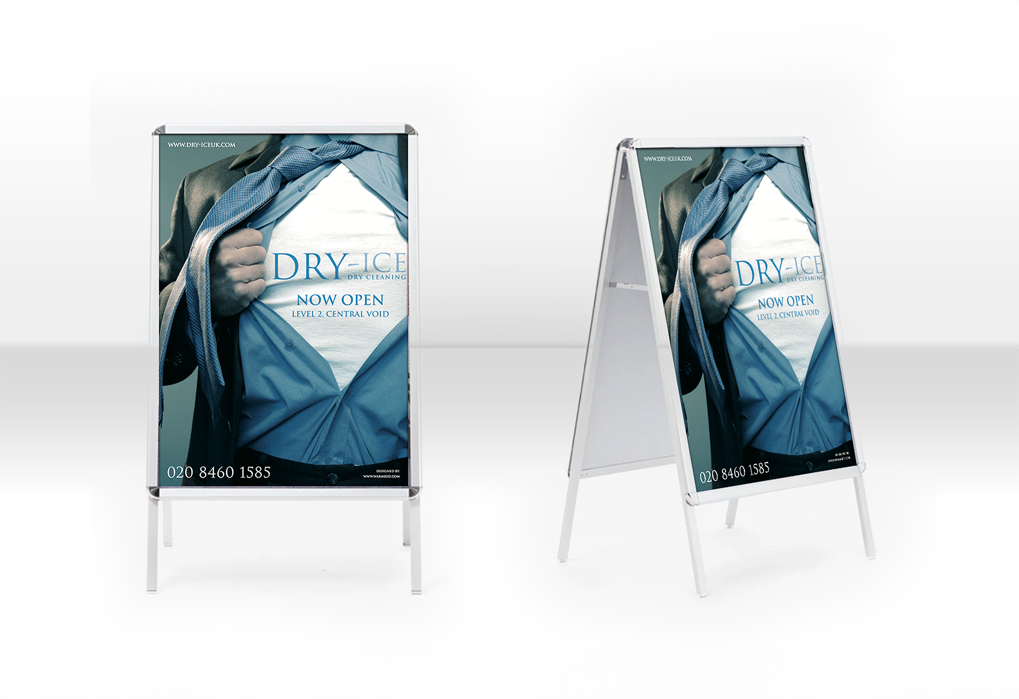
To support growth ambitions, we developed a cohesive set of branded touchpoints — from a 6-page DL leaflet introducing the service offering to prospective franchisees, to external signage, interior wall graphics, van decals, branded tissue paper, and counter displays. We carefully designed the customer journey to create a premium experience from drop-off to collection. Furthermore, the franchise branding design was intentionally simple to roll out, easy to maintain, and consistently striking.
The result is a brand that doesn’t just look clean — it feels fresh, confident, and ready to grow. For more information on brand identity design that will work wonders with your franchise branding design, click here >>