The Brief
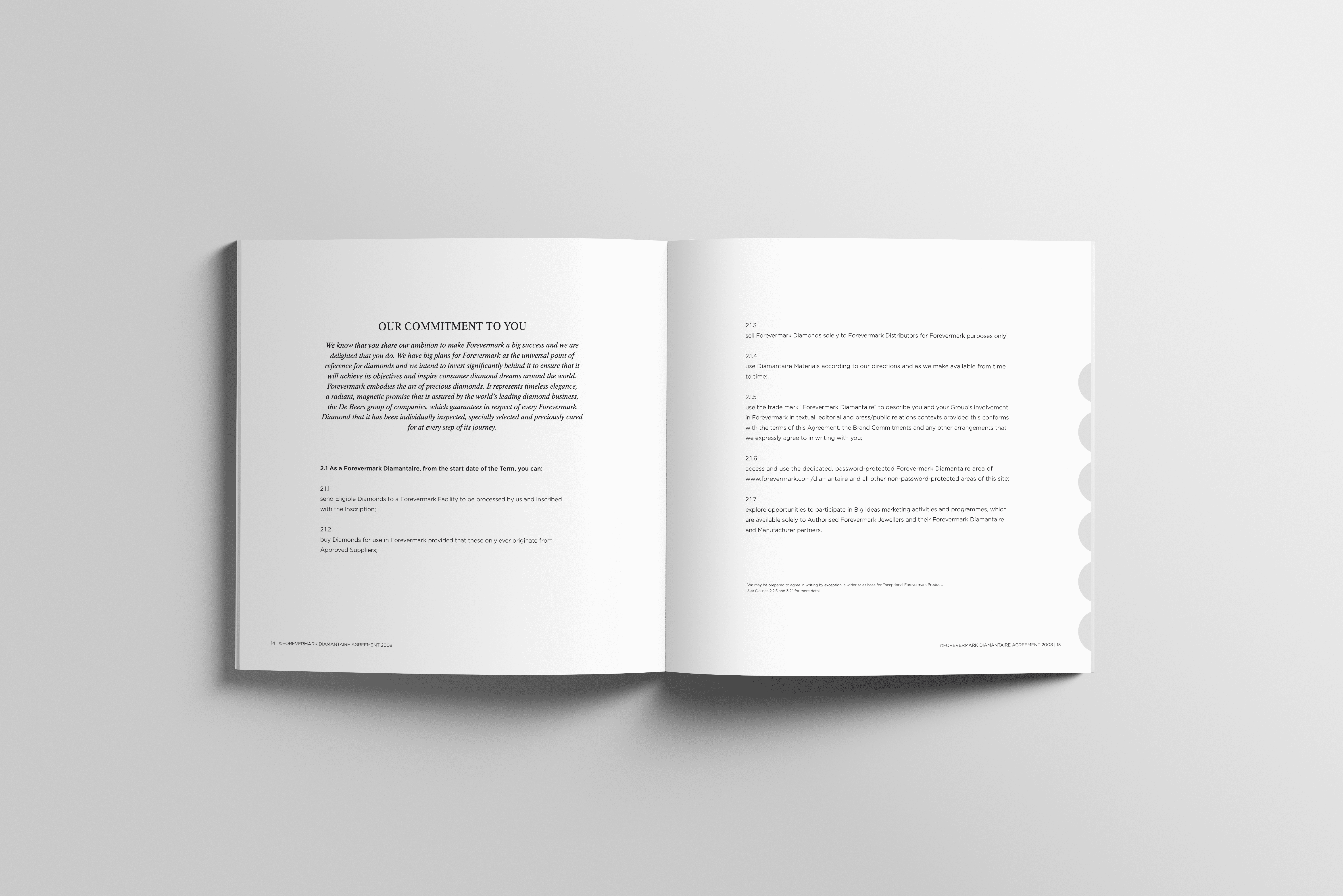
We brought the newly developed Forevermark brand to life across essential communication materials for Asia markets. This included brand ambassador training content and formal contract documents. To ensure authenticity, we created these materials in both Simplified and Traditional Chinese, targeting key territories such as China, Hong Kong, and Taiwan.
As some of the first real-world applications of the new identity, these touchpoints set the tone and standard for luxury brand interpretation. We took responsibility to apply the guidelines and actively uphold the brand’s integrity — making sure every detail reflects Forevermark’s values of timeless elegance, clarity, and emotional resonance.
We translated strategy into execution, establishing a consistent, confident visual language that resonates across borders and moments alike.
Design Approach
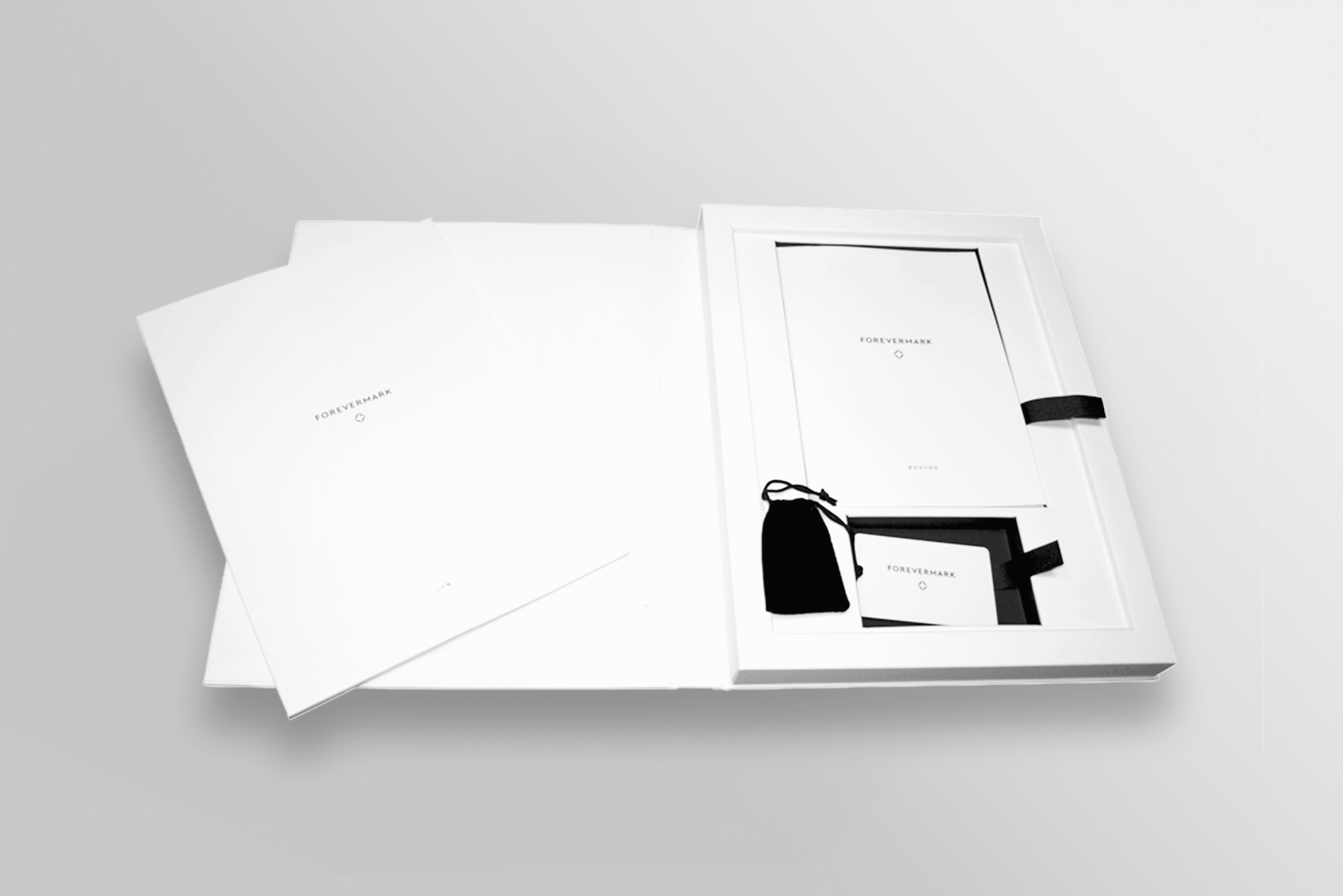
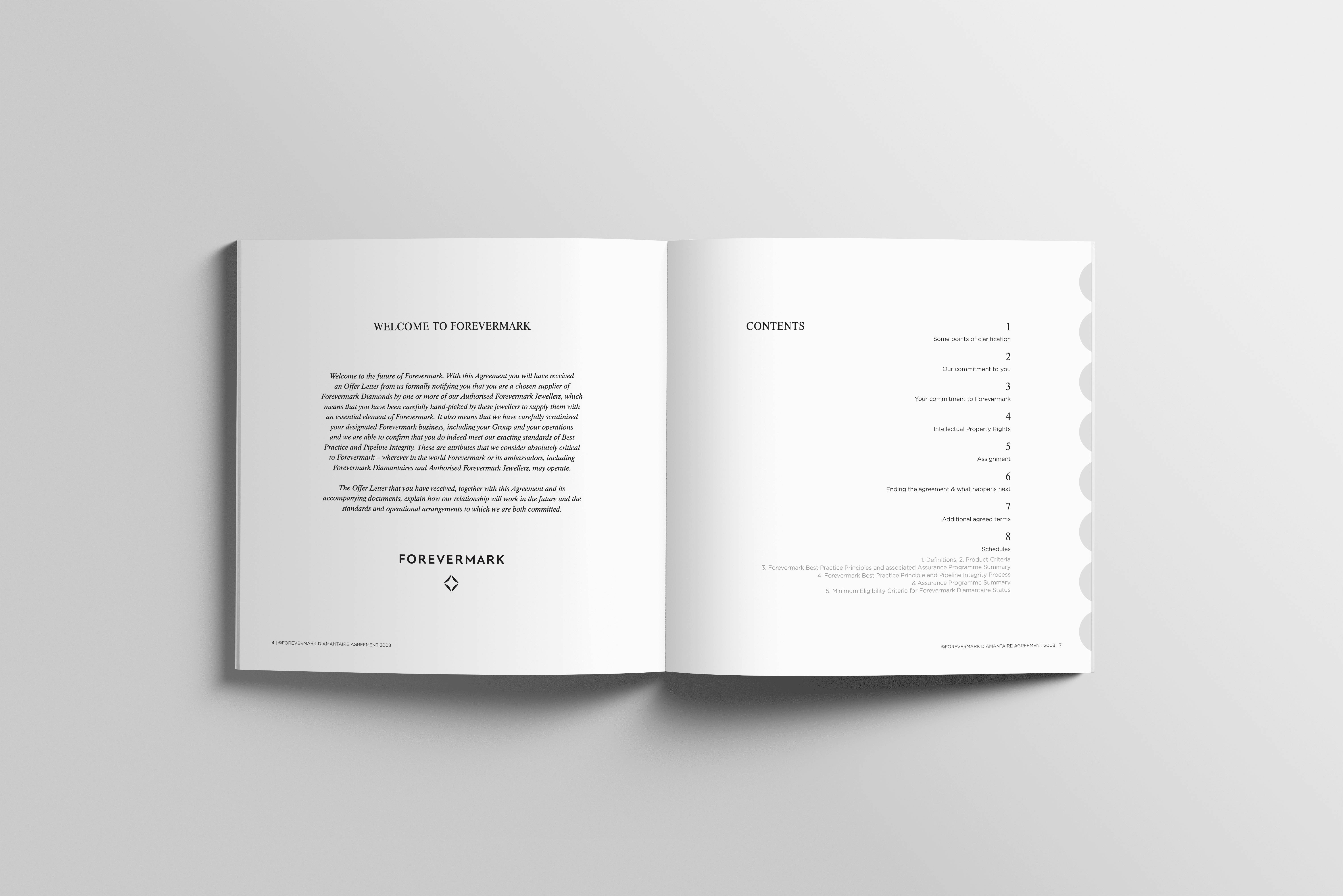
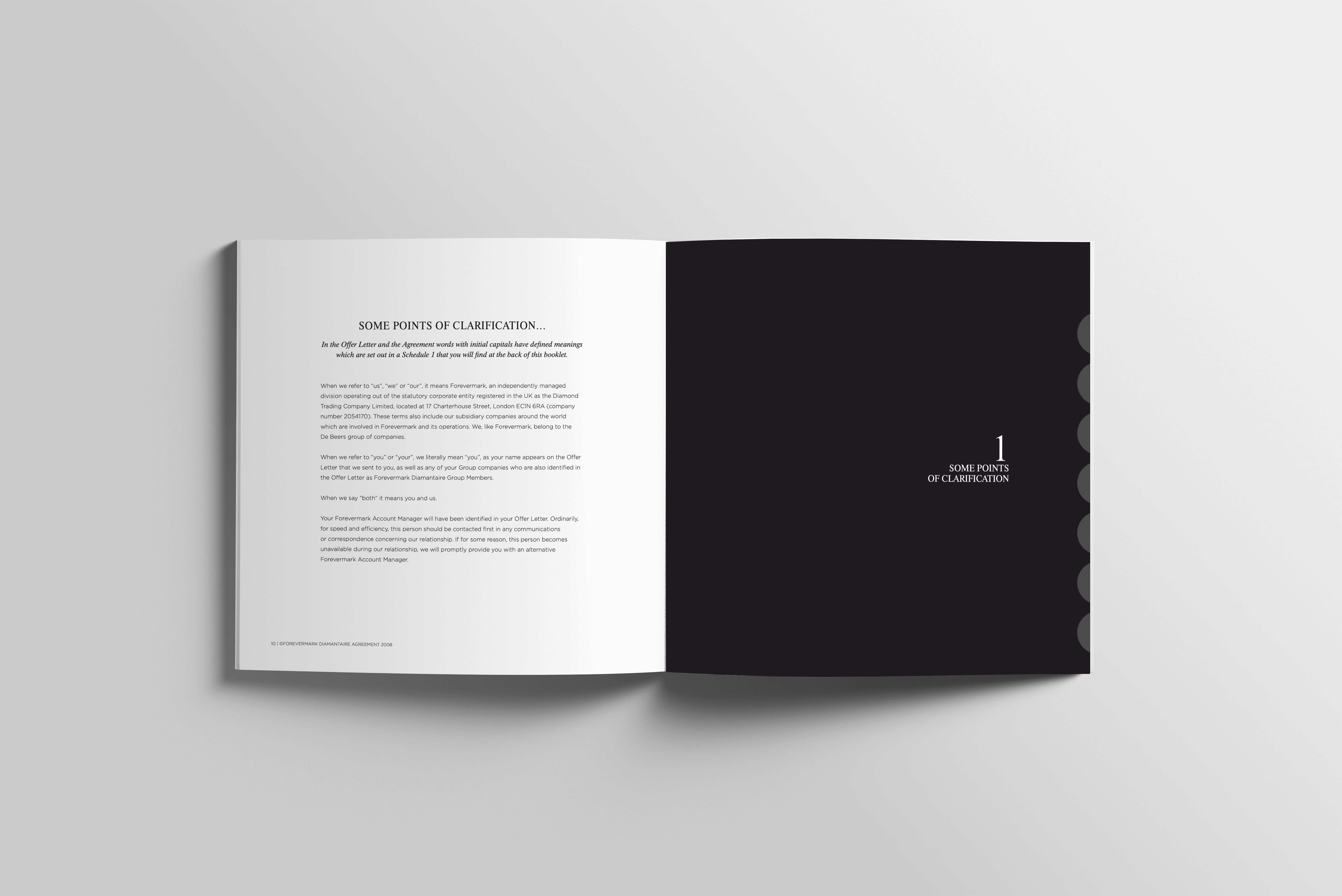
Forevermark’s brand guidelines call for an elegant, minimal vision — where simplicity elevates precision and restraint. Even the most basic communications demand meticulous design, leaving no detail overlooked. From material selection to layout — and even the satisfying click of a magnetic closure on packaging — each element embodies the brand’s refined sensibility.
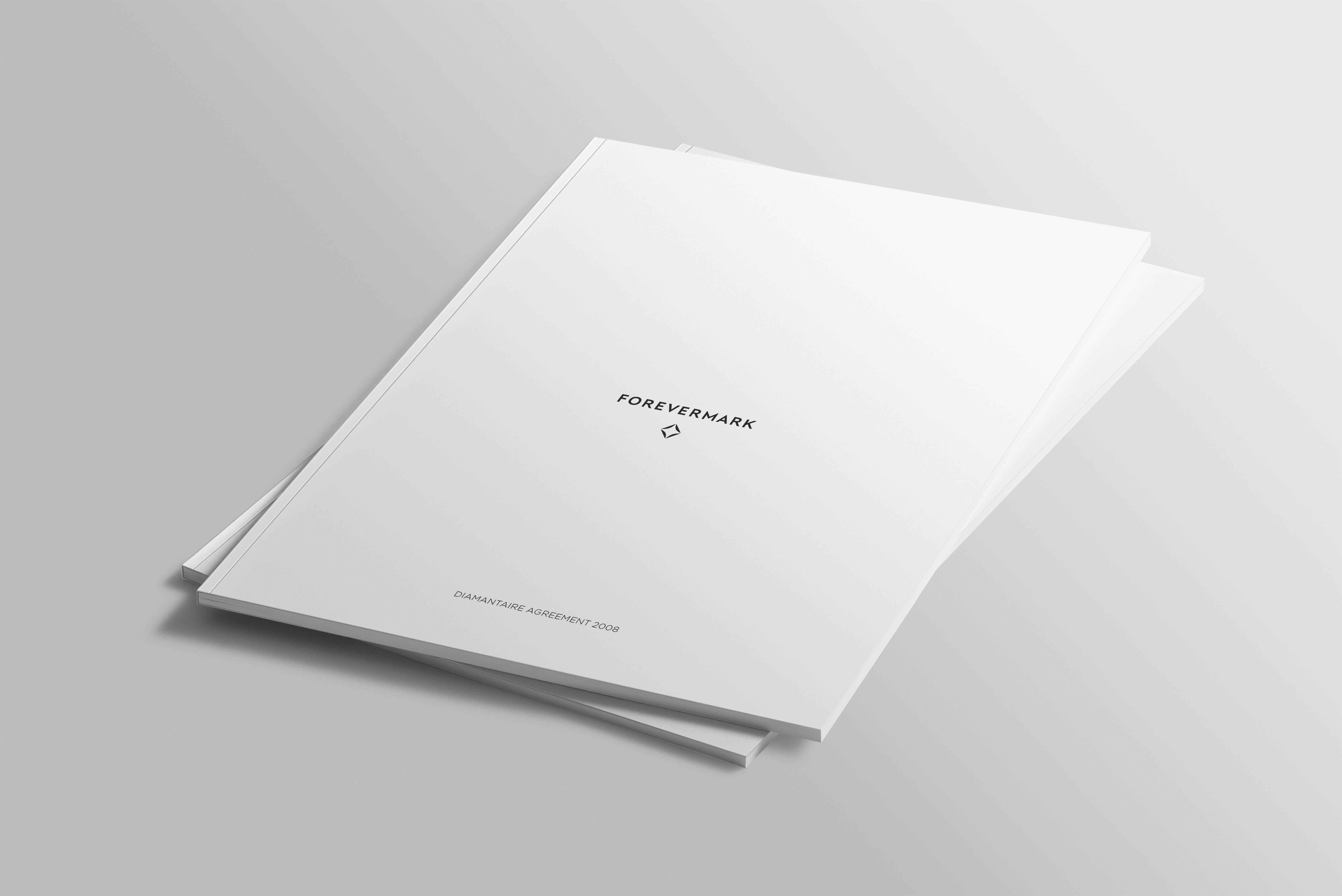
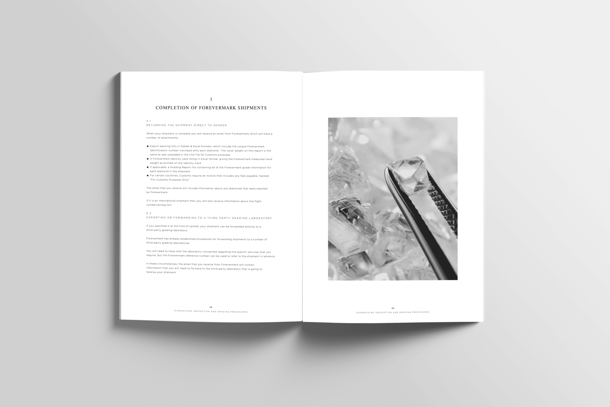
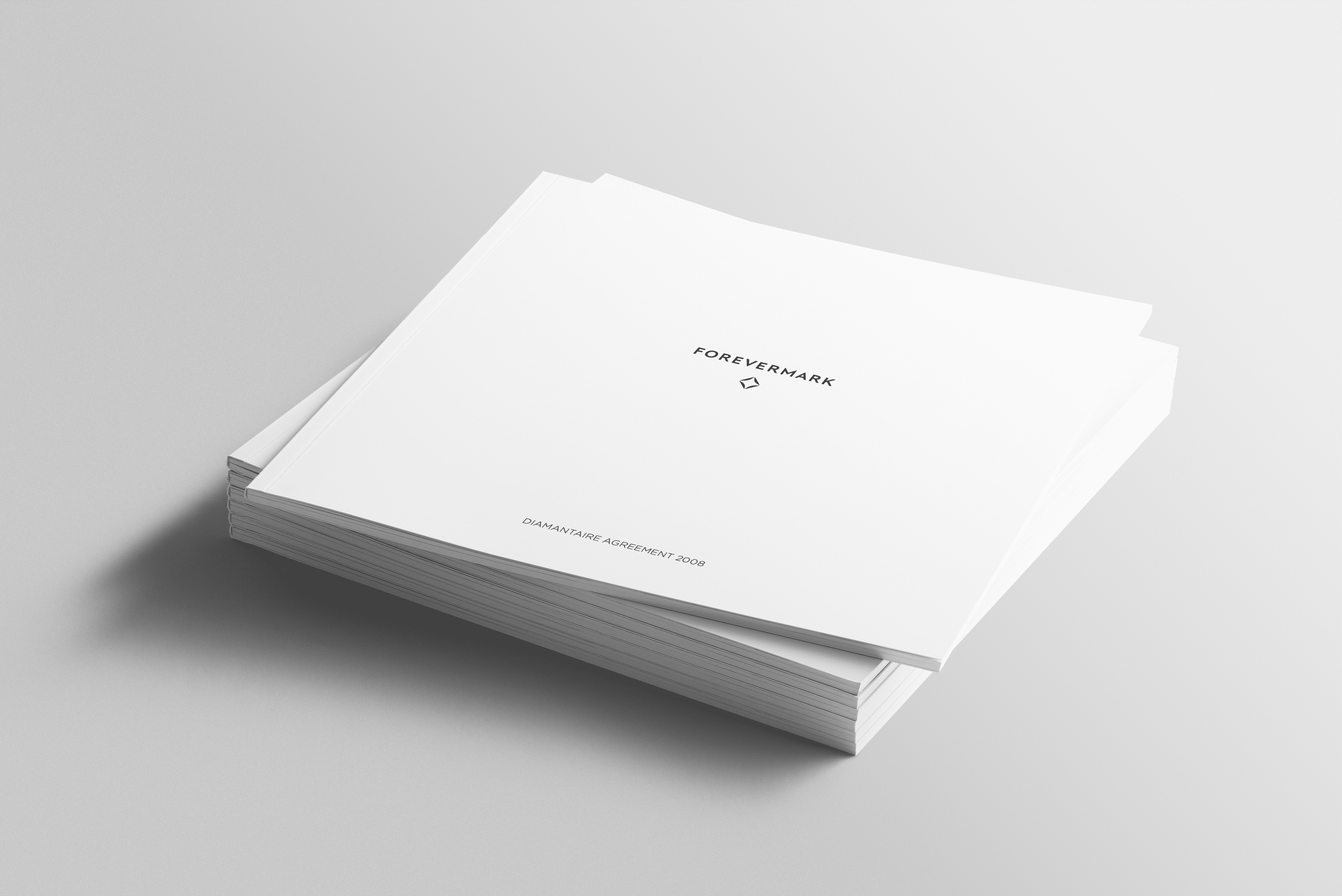
We initially focused on delivering a formal contract set, packaged with a branded CD, alongside a brand ambassador presentation kit featuring prompt cards and a precision-crafted glass loupe. These tools express the brand physically — inspiring confidence, clarity, and consistency.
Managing the extensive translation and adaptation process presented a key challenge. Producing all materials in both Simplified and Traditional Chinese required close coordination across copywriting, proofing, and client approvals. Through detailed project management, we ensured cultural accuracy and smooth execution.
Material choices played a pivotal role in bringing the visual language to life. We paired premium paper stocks with subtle matt lamination and sharp gloss foil detailing — creating a tactile balance of restraint and luxury. The result is a set of beautifully understated yet highly considered brand materials that perfectly reflect Forevermark’s ethos: timeless design with uncompromising attention to detail.
This project is an excellent example of our expertise in brand identity design for global clients.